Step OneAdd a USB drive to the USB port on your Mac. Step TwoOpen the app called "Disk Utility." Step ThreeSelect the USB drive on the bottom left side of the menu pane. Note: Select the drop down menu at the top left (next to "Disk Utility") and select "show all devices." Step FourSelect "erase" at the top left to format the disk (make sure there are no files on the drive or you will lose them). Step FiveSelect "Format" and then "Mac OS Extended Journaled." Under "Scheme" select GUID Partition Map. Step SixSelect "Partition" at the top menu bar. Select the (+) symbol beneath the pie chart to add another partition. Note: One partition comes with drives by default. Use the Pie Chart to select how much space you want to dedicate to the partition. Step SevenSelect "Apply." On the left menu bar, you wil notice that you USB drive now has two partitions. Caution: You must make sure to select the USB drive and not your hard drive by mistake or you risk losing the files you have on your computer's hard drive.
1 Comment
Article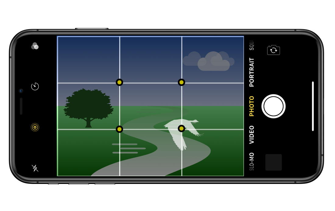 The rule of thirds is a grid for the iPhone camera viewfinder, which serves as a guide to framing your subject. The grid lines reinforce the the edges of the picture plane (camera lens), providing an internal structure to guide the placement of things. 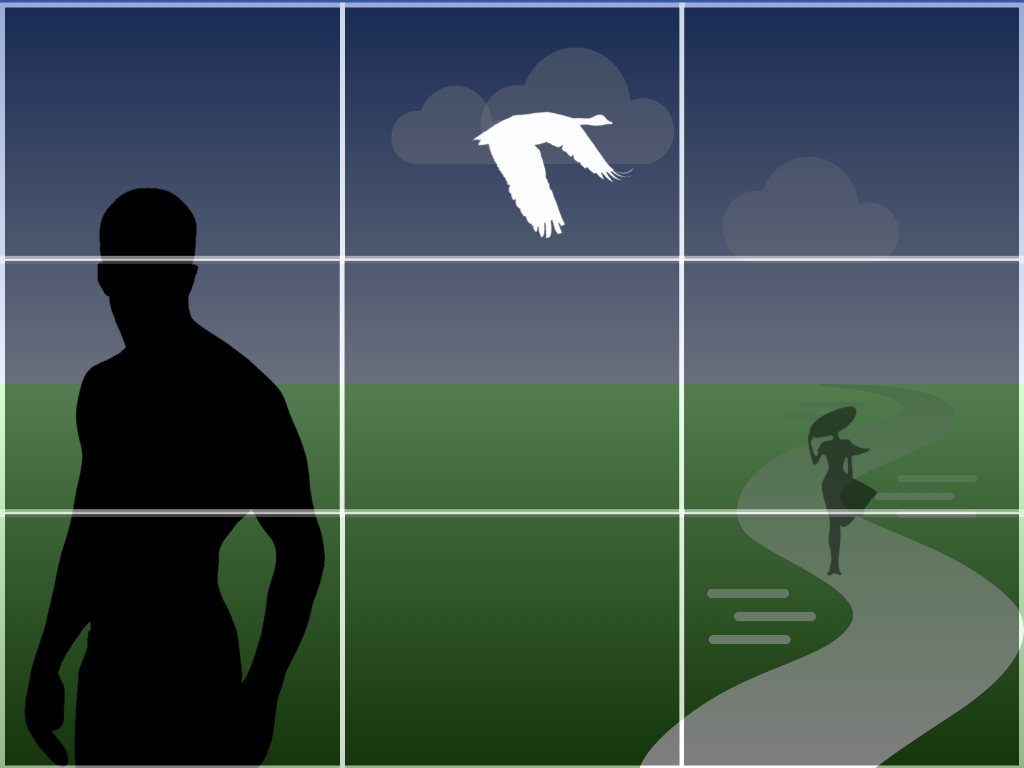 In this example (above), the rule of thirds guides the placement of each element, creating a zig zag pattern that moves the eye across the composition. The variation in scale contributes to the movement, but also establishes a relational distance. 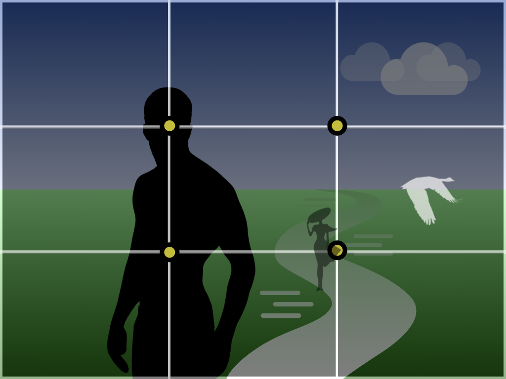 While the grid helps to establish spatial relationships, the intersection of the vertical and horizontal lines at the center (above) function as focal points to anchor the viewer's attention. 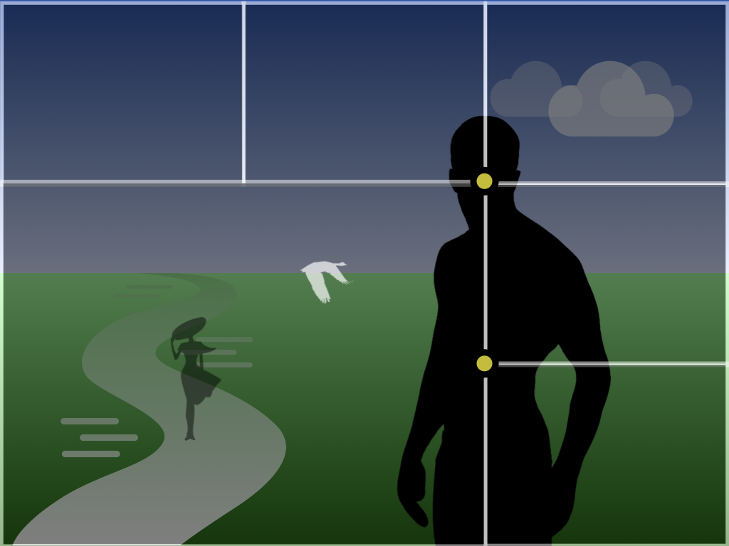 In addition to creating spatial relationships and focal points, the rule of thirds can be used to open up the space (above), creating a picture-in-picture effect to deepen the narrative. You can also use this approach to isolate specific content for a more serene and contemplative subject matter (below). 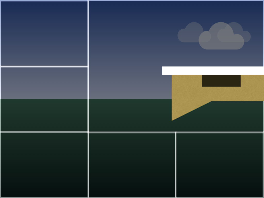 In contrast to the 4:3 aspect ratio in the iPhone camera, video follows a wider 16:9 aspect ratio. The rule of thirds provides the same organizational structure, but offers more breathing space, which is especially useful for motion pictures or video. 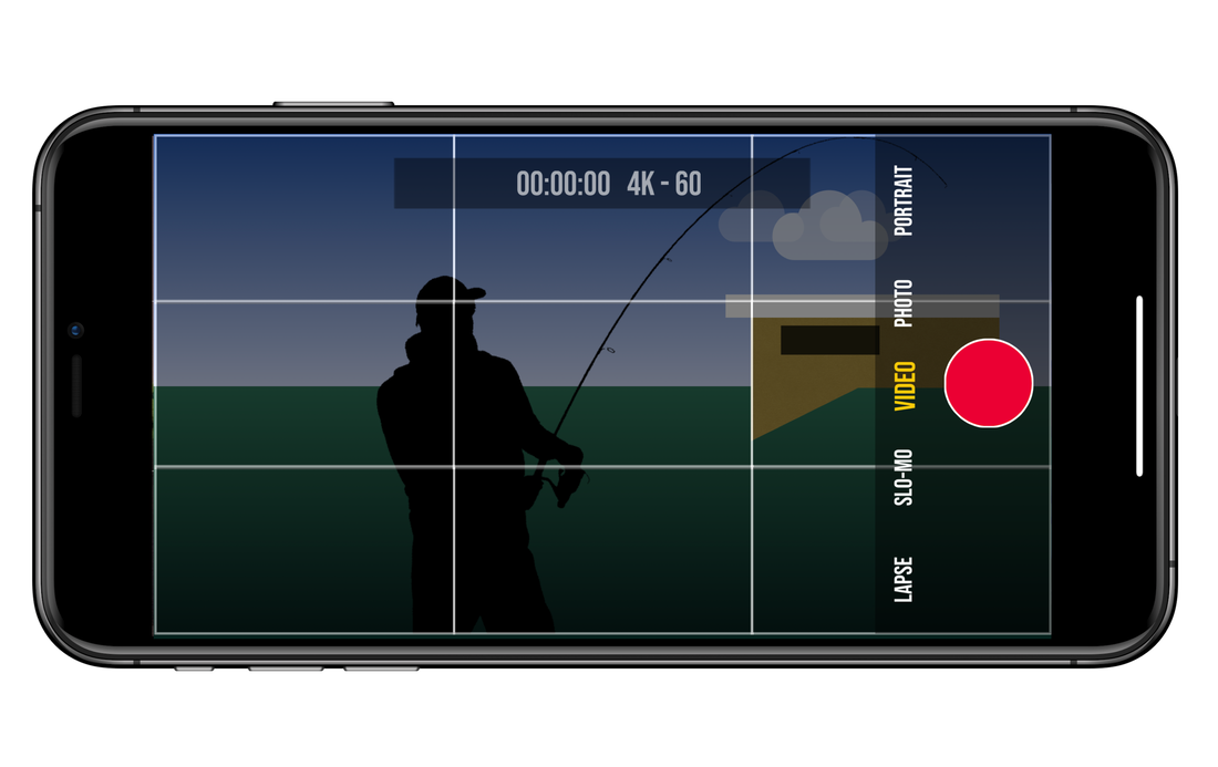 Regardless of the aspect ratio, the rule of thirds is a useful tool for composing a photo or video recording. By using the rule of thirds, the picture plane is not merely a frame that shapes our perspective, but a canvas upon which we make the world special.
Note: The rule of thirds grid can be found in the iPhone camera settings, with the option to toggle on or off. In the era of COVID-19, art is omnipresent, providing ample opportunity to expand your digital palette. This can be done by using apps interchangeably. By using multiple apps, you can heighten your creativity by producing a variety of original and sometimes unexpected results. 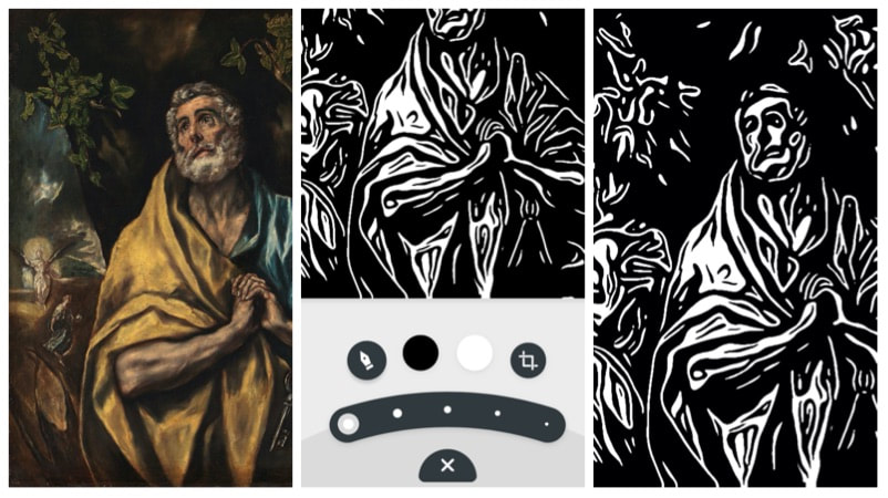 In this example, I chose to begin with a digital version of El Greco's painting of St. Peter in the National Museum in Oslo. To initiate the creative process, I imported the image into Inkwork by Code Organa. Inkwork enables you to choose from a variety of styles in black and white that resemble ink drawings and linocuts. Through the use of an app, I initiated the creative process by changing a painting to a graphic, print-like image. This may seem odd, but historically prints were often made of paintings to widen their distribution, so others could appreciate them. 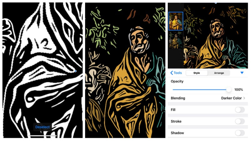 Next, I imported the work I created with Inkwork to Pixelmator by the Pixelmator Team. Pixelmator has a quick selection tool that lets you select specific areas in a way that is more intuitive than your typical wand tool. Gradually, I removed the white areas and replaced them with colors in the original painting. The result is an image that looks like a linocut with multiple layers of color. I could have stopped there, but I continued by adding the original painting as a layer and using blend modes to synthesize the two images. Of course, you can continue this process forever. The creative process leads you to explore endless variations by either using other apps or changing your image manually with your finger or stylus. Either way, art serves as the inspiration and catalyst for heightening your creativity to greatly expand your digital palette.  By Tim Brown Do you wish you could use more than one window on your Mac? This can be done very easily using gestures on your trackpad and/or keyboard functions. Multiple Windows on the DesktopLike any standard computer, the Mac comes with a desktop by default, which enables you to open multiple applications at the same time. The common way to access your open apps is to retrieve them from the dock. If you want to view all open apps as floating windows (what Apple calls “Mission Control”), press F3 on your keyboard or swipe upward on the trackpad with four fingers. Similarly, if you swipe downward on the trackpad with four fingers, you will see multiple views of a single app (what Apple calls “App Expose”). For example, if you have five separate windows open in Safari, App Expose will let you see them all at the same time. To learn more about trackpad gestures go to "System Preferences" and select "Trackpad." 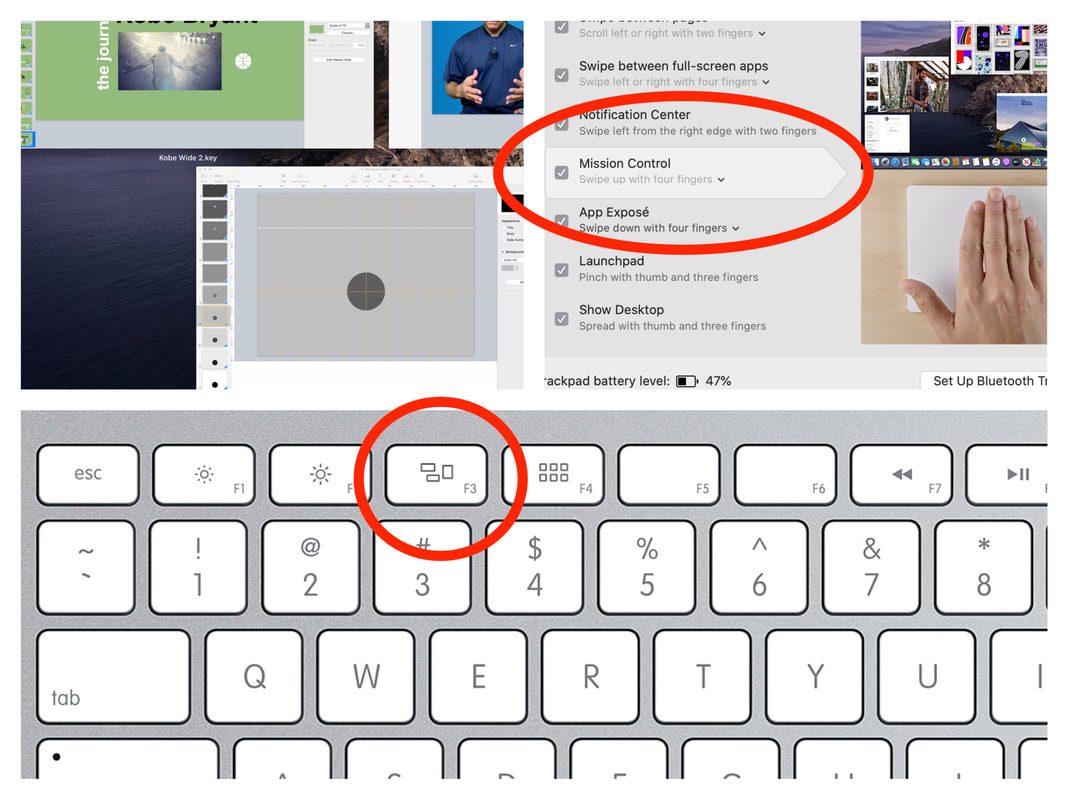 If you don't want to view each open application as a floating window, you can also select Command+Tab on your keyboard and use the arrow buttons to cycle through until you find the app you want. Multiple DesktopsIn addition to viewing multiple windows or applications, you can also set up multiple desktops. You can achieve this very easily by repeating the "Mission Control" gesture and/or by pressing F3 and then moving your cursor to the very top of the screen. You will find at the very top a small thumbnail with the word "desktop" underneath. While hovering your cursor over the top thumbnail pane, slide it over to the right and select the plus symbol. A second desktop will appear to the right of the first desktop. You can now move windows and/or apps from desktop 1 to desktop 2 by selecting one of the apps in "Mission Control" and dragging it over to the second desktop. 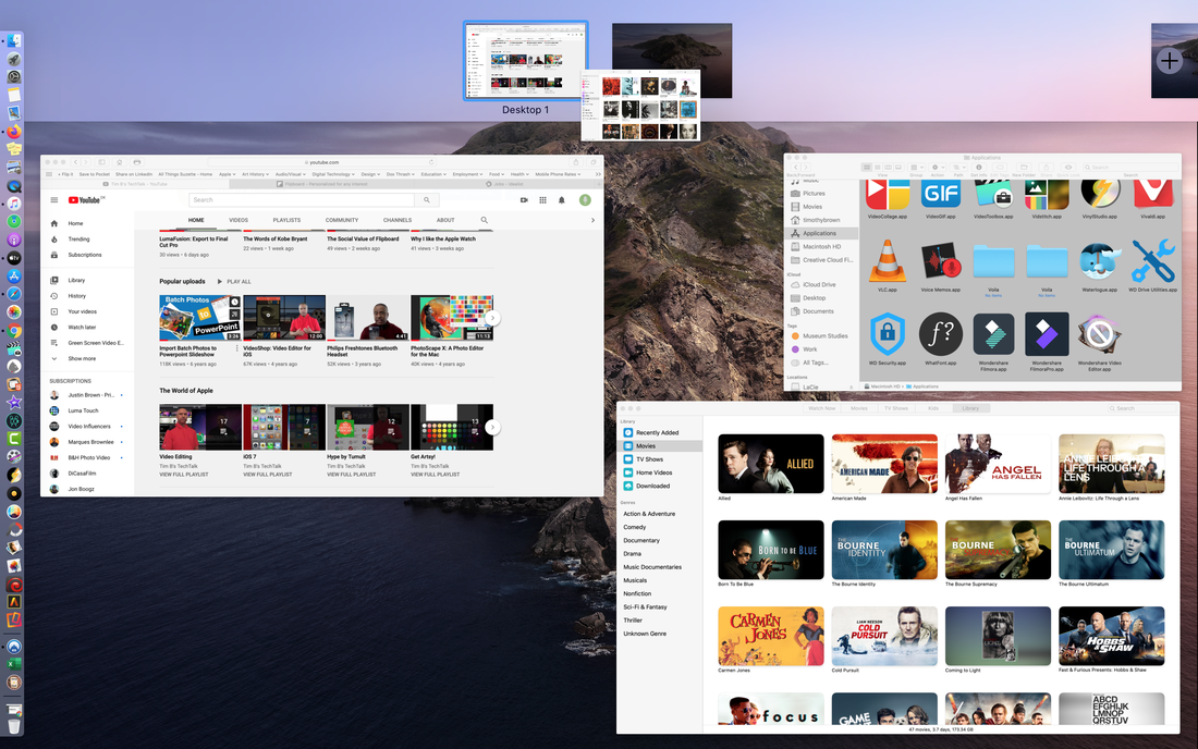 Depending on our personal preference, you can conceivably place each open application on its own desktop. You can easily navigate between each desktop by selecting control+arrow keys (left or right) or by using four fingers to swipe right or left on your trackpad.  Some users are comfortable with just one desktop, but it's nice having the multi-window option to enhance your workflows.
by Timothy Brown [Transcription] Hi Everyone: Welcome back to Tim Bs Tech Talk. Today, I want to talk about Flipboard. Flipboard is arguably the most popular newsreader available today. Originally released in July 2010 for the iPad, Flipboard was eventually made available for the iPhone, other mobile platforms, and desktop computers. Flipboard essentially aggregates news from a variety of sources and invites users to become active contributors. News readers are ubiquitous, but somehow Flipboard managed to make them social. Before I explore this aspect in more detail, let’s first take a brief look at news readers. News readers enable you to access news feeds by choosing from a range of pre-selected topics or by using a built-in search function to find specific areas of interest. In many ways, mews t eaders supersede "save-it-for-later" apps like Instapaper and Pocket because they serve both as a vehicle for finding news as well as a place for storing articles away. Flipboard represents the best of this genre, but other apps have been important contributors. USA Today and NPR were some of the first established news sources to enter the market, yet other apps like Flud, Pulse (eventually Linkedin Pulse), SkyGrid, Zite, News360, Feedly, Early Edition 2, Paper by Facebook, Pulp, and Google+ were key to making news readers a success. Most notably, Early Edition offered the best example of skeuomorphic design, a digital replication of a traditional newspaper (that is, before Apple flattened everything out), Zite enhanced personalization, Feedly offered greater speed and fluidity (and options for Google customers to migrate their feeds after the app went defunct), and Paper by Facebook superbly integrated Facebook feeds into a news reader format. Pulse, however, was the first app to make the news reader experience accessible through a browser, encouraging Flipboard to elevate its game. Apple News entered the market much later, buildi ng on the success of these earlier news readers, but taking a more top-down approach by introducing curation and subscriptions to increase revenue streams. News reader apps have greatly transformed how we access news today , but Flipboard figured out a way to make them social. Flipboard has been known for its tile-flipping interface, but the most significant development came when the company introduced 'My Magazines." While "Smart Magazines" provide top-down curation (articles generated for you by topic), My Magazines consist of stories YOU collect and assemble in accordance with the theme or topic YOU choose. Essentially, you curate your own collection of articles and assemble them into your own magazines. There are no other news readers that provide that level of user-generated curation. What Makes Flipboard Magazines Social?My Magazines are inherently social because they can easily be viewed by other Flipboard users. The process is simple: 1. Start a new magazine. 2. Give it a title and a description (optional). 3. Check the option to make it public (so everyone can see it). Once your magazines are made public, people can subscribe to them, flip articles into their own magazines, or share them online. On a more intimate scale, magazine owners can invite others to contribute articles to a magazine. Who Can Benefit from Flipboard?Businesses, single professionals, or bloggers can benefit from Flipboard Magazines because articles posted on proprietary sites via Wordpress, etc. can be flipped into a Flipboard Magazine, inviting the world-wide web to have access to their content. Why should anyone limit themsleves by posting articles on a dedicated site that only a handful of people will read? By setting up a Flipboard magazine to correspond with your blog posts online, you can greatly increase your online presence. Furthermore, you invite people to actively collect and share your articles in ways you could never do internally through paid memberships and exclusive followers.
Top down models are useful when the intent is to make your context exclusive. On the other hand, if your goal is to reach broader audiences, Flipboard provides the perfect vehicle for doing so. Arguably, Keynote by Apple is the best presentation tool available for desktop and mobile platforms. Historically part of Apple's iWork Suite of applications, including Pages, and Numbers, Keynote established itself as a desktop application, gradually making its way to iOS. In general, MacOS and iOS are beginning to look a lot alike in terms of the graphic look and feel of the operating systems, but also in terms of continuity and accessibility. New DevelopmentsThe similarities between both the desktop and mobile platforms are especially noted in some of the latest developments in Keynote for iOS. Here is breakdown of the latest features in Keynote. 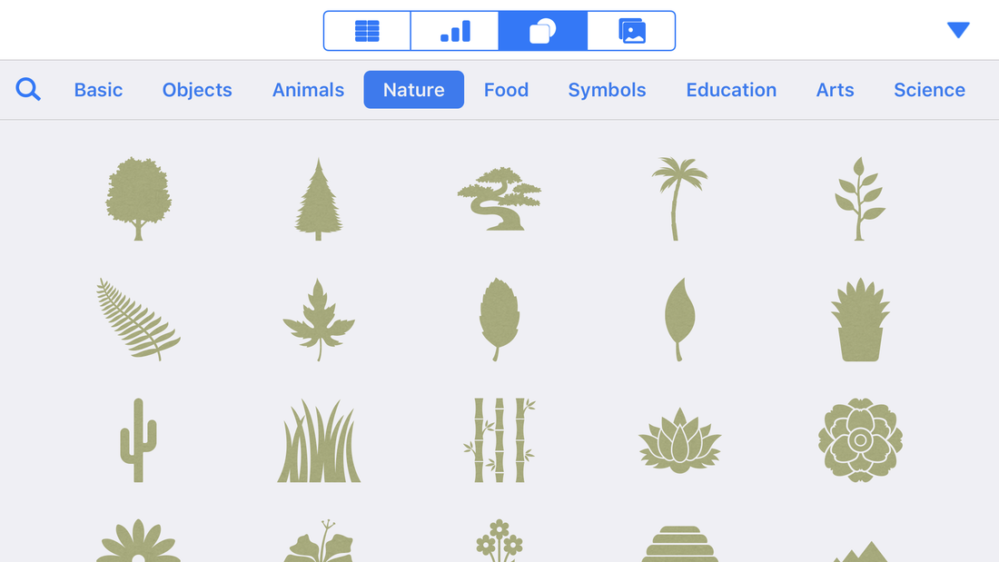 ShapesOriginally, Apple introduced shapes as graphic elements that could be added to your presentations. The basic shapes feature now has been greatly expanded to include thirteen additional themes: Objects, Animals, Nature, Food, Symbols, Education, Arts, Science, People, Places, Activities, Transportation, and Work. Shapes can be formatted like any other shape, including the ability to change to solid or gradient colors; add shadows, borders, and reflections; add text, and animations. 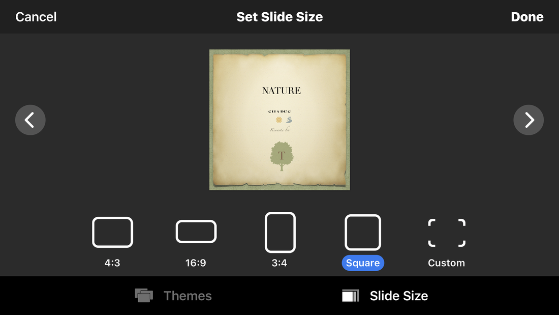 Slide SizeTypically, presentations come in two formats: 4;3 (standard) and 16:9 (wide screen). Under the documents set up tab, Keynote offers additional sizes, such as, 3:4 (standard portrait size) and 1:1 or square. The most significant option is the ability to customize the document size to include, for example, 9:16 or what has become a standard for Instagram Stories and IGTV. This level of customization expands the scope of what you can do with Keynote on your IOS device, especially when accompanied by advanced options for exporting projects. ExportsUp until recently, the parity between MacOS and iOS was okay (taking into account recent developments with iWork in the cloud), but still lacked behind the desktop due to the limited ability to export projects. Keynote for iOS has been limited to exporting to PowerPoint, and PDF, making it barely useful beyond the iPad itself. As of this date, Keynote now offers the ability to export images in high or low resolution and in PNG and TIFF formats; you can also designate a range of slides for exporting images. 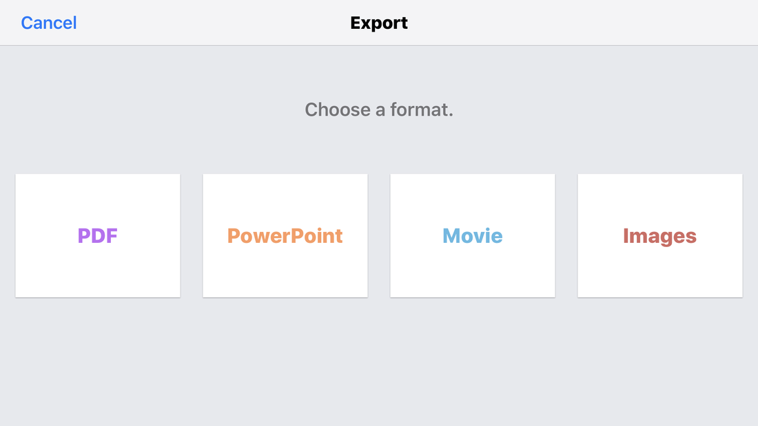 An Added BonusIn addition to exporting images, Keynote now exports to movie format. This development is probably the most substantial, bringing Keynote for iOS closer to the Mac in terms of performance and features. When exporting to movie, the number of seconds for slides and builds can be customized and options for resolution include 720p, 1080p, and 4K. ConclusionIn summary, the productivity level of Keynote for iOS has been greatly enhanced by expanding the integration of graphic elements in the form of thematic shapes, adding customization to slide and/or project sizes, and expanding export options to include images and movies. Furthermore, other enhancements like iCloud Drive or Files integration and drawing tools as a additional resource for adding content to slides makes Keynote a game changer. Timothy Brown, Host of My Apple Podcast
July 1, 2018 Tim Brown Green Screen Teleprompter is an application that is part of a family of teleprompter apps designed by the AutoCue App Team who designed Prof. Hornet Teleprompter Pro, which I reviewed during a previous episode. If you missed the earlier review, Prof. Hornet Teleprompter Pro enables you to add scrolling text to your iPhone or iPad screen and record yourself at the same time. This is very practical because iOS presents challenges when reading scripts, while facing the camera at the same time. This app enables you to align your scrolling text with the internal camera of your device, thereby producing much better results. 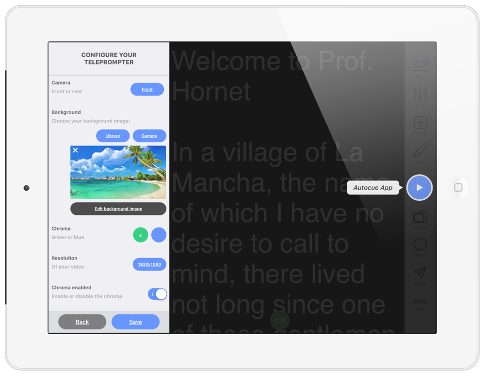 The developer reached out and informed me that AutoCue also makes another app called Green Screen Teleprompter. I was genuinely pleased to hear this because I keep a green screen on the wall of studio, and so I appreciate having this as an option when recording. The layout for Green Screen Teleprompter is essentially identical to Prof. Hornet, with the exception of the green screen feature, which is an additional menu item found under the set up tab. Scrolling all the way to the bottom, you will see an option for front and rear facing cameras, underneath that an option for Background. The app provides an image by default but you can grab your own image from the camera or camera library. You also have the option to edit the background using the editing menu to access adjustment tools, effects, and text options. 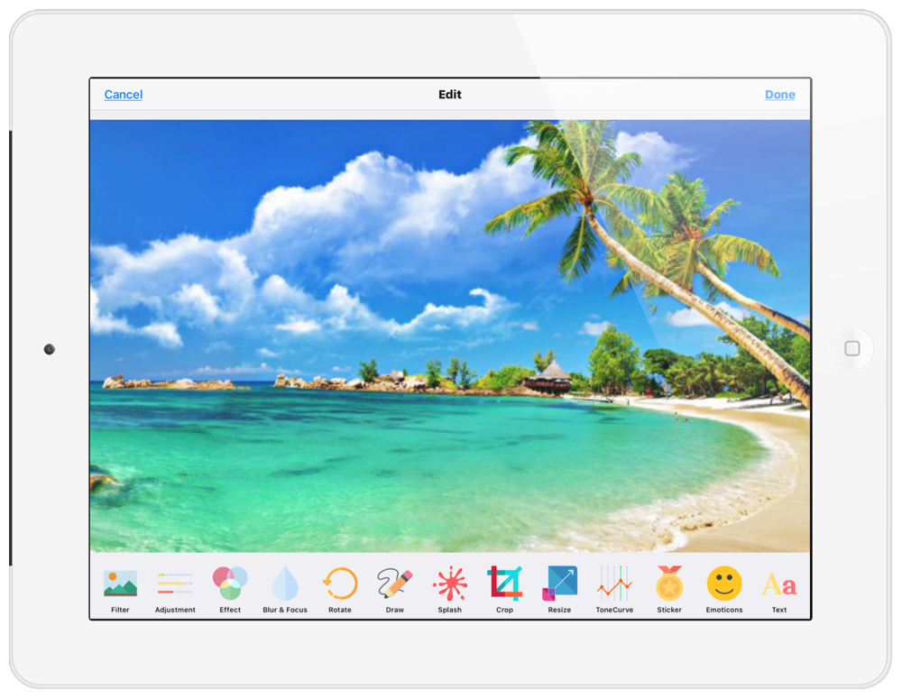 Under background, is an option for selecting Chroma in green or blue, an option for resolution, and the ability to toggle on or enable Chroma. There are no adjustment tools available to key out the background, beyond what the app does automatically. In the case of most apps, the lack of controls will normally produce a less than fair result, but the AutoCue team appears to have nailed the technology. As a general rule, I always try to make sure my screen is well lit and light is distributed evenly in order to avoid inconsistent results.The following episode featured below was recorded with Green Screen Teleprompter. I must say that I was very impressed with the results and plan to use the app frequently. If you caught my previous previous review of Prof. Hornet Teleprompter Pro, I would like you to keep in mind that the green screen option is not included. You must get the Green Screen Teleprompter App if you plan to key out your background while recording. This will help you with your decision to get one or the other, or both.
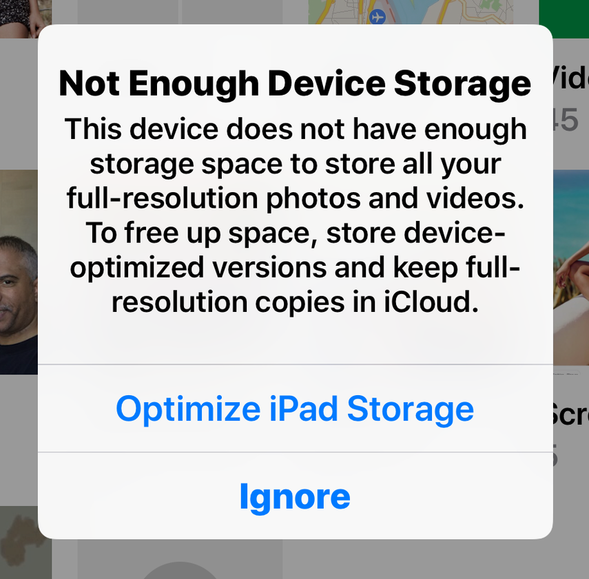
It's rare to find an app that integrates a teleprompter with the ability to record yourself and key out the background at the same time. It's well worth it! I'm writing this blog because I made a bold decision about managing my files on my iOS devices. I'm no longer using the optimize storage feature because I have encountered numerous issues that are ruining my experience. In short, I have a hard time accessing files that have been optimized because third party apps either can't read them, have a hard time loading them, and/or become divorced from projects that rely on them.
Is this Apple's Fault?Yes and No. Some apps manage to access files that are stored in iCloud for optimization purposes, but the results are inconsistent. Files can become slow to load or cause the app to quit. It appears that developers can update their apps to accommodate optimized files because some apps seems to do this without a problem. However, based on my experience most apps do not access optimized files effectively, thereby creating an unpleasant and inconsistent experience. Why does this matter?This issue matters for several reasons. First, customers are paying to use Apple's service, so it should be a convenience for the customer and not a hassle. Second, the user experience is central to why we invest is particular systems (Apple, Google, Amazon, etc.). Third, the enjoyment one gets from using third party apps is devalued due to ineffective, inefficient and unreliable access to optimized files. What kind of problems can occur?I use Lumafusion, a comprehensive video editing application, for most of my video projects. Lumafusion allows you to maintain a library of projects, which can also be duplicated in case you want to build on an existing project. However, I've lost many of my projects (projects I've spent hours developing) because the files imported from my iPad photos library were disconnected from the project as the result of being optimized and stored in iCloud. There may be a way for developers to sync with files that are optimized, but it's problematic because there is a lack of consistency regarding how this feature is integrated with other apps. Logically, it can't work because files that are accessed prior to being optimized are disconnected once optimization occurs. Furthermore, if you decide to import files that have been optimized, files are re-download to your device, only to find later that they have been re-optimized again. Is there a work around?If you manage projects through third party apps or rely on media in your camera library that has been optimized, I suggest that you find alternative locations for accessing files (at least until Apple comes up with a solution for making this integration less of a headache). Surprisingly, Apple's new Files App is a great alternative. The Files App let's you access files stored on iCloud Drive (which is distinct from iCloud used for optimization purposes), and other third party storage services like Google Drive and Dropbox. When using these services, media can be accessed without a problem because the path to those files remain undisrupted. The only other suggestion would be to enable third party developers to make copies of optimized files that can be accessed locally within the app itself. Turning Off OptimizationIf you are encountering this problem, you can turn optimization off. You can find this option in settings under Photos. I have done this quite often, but I continue to get the following message: "Not enough device storage." I keep getting this message even though I have 72 GBs remaining out of 128 GBs. It's almost as if I'm being forced to optimize even though I have no need to (I will try the usual troubleshooting processes and update this blog when I find a solution). Final ThoughtsAs someone who works on many projects that rely on media connectivity, I plan on using the Files App to access media stored in iCloud Drive or other third services like Dropbox. Unfortunately, there are still a lot of apps that have yet to connect to "Files," relying exclusively on the camera roll for media access. In case of the latter, there is always the option of upgrading iCloud storage to 2 TBs (which may be why Apple keeps sending me those annoying messages). I would hate to think that is the reason why Apple is forcing me to optimize (since I have barely used 50% of my space, but I wouldn't be surprised considering how aggressive Apple can be at sucking more money from you. If there is a more logical explanation for this issue, I will update this post.
Timothy Brown, Host of My Apple Podcast In 2016 during the days leading up to WWDC, Phil Schiller, Vice President of World Wide Marketing at Apple, introduced a new subscription model for developers. Under the new plan, developers were to receive 70 percent of revenue and 30 percent went to Apple. If customers remained faithful subscribers for one year, the share of the revenue changed to 85 percent for developers and 15 percent for Apple. This model still exists, but with some updated guidelines for pricing and other regulatory measures. Apple has been quite successful in its pursuit of profits, announcing during their quarterly earnings report in July 2017 revenue of 42.4 billion “and earnings per diluted share of $1.42 in the year-ago quarter. International sales accounted for 61 percent of the quarter’s revenue.” This success is largely attributed to its four operating systems, iOS, macOS, watchOS, and tvOS, and the services that undergird their success, namely, the App Store, Apple Music, Apple Pay, and iCloud Drive. The services provided by Apple are key to its business model because it ensures longevity in terms of maintaining consumer allegiance, while seeking new revenue streams. Paying for services rather than products has become a standard model in terms of how we consume media, paying for music streaming rather buying CDs or renting movies rather than buying DVDs. The services model which ensures a long term commitment from consumers, supported by automatic renewals, is now operating in full force with Apple’s aggressive push to promote the App Subscription model. With app subscriptions, developers can offer a wider menu of options, in which apps are used, not as products that consumers own, but as services they rent for a specific periods of time (e.g. weekly, monthly, or yearly). The zealous push to promote the subscription model has been viewed for some as an inevitable move by Apple. Writing for the Verge, Vlad Savov makes note of this emerging development: “Apple is one of those rare few companies that can take an ongoing evolution and focus and distill it into a revolutionary change. That’s the immodest thinking behind the company’s ambitious "Subscriptions 2.0" plan for the App Store, which aims to convert iOS users from one-off app purchasers into loyal subscribers. It’s nothing new in and of itself, but Apple’s wholehearted embrace validates and underlines it: subscriptions are going to play a huge role in the future of software.” The Subscription 2.0 model is described in more detail by Lauren Goode in her article titled App Store 2.0 which poses the question “Can Apple Do It Again?” In other words, can Apple build on the App Store’s success by introducing a new business model that will forever change how we consume apps? In the article, Goode quotes Phil Schiller whose enthusiasm for the subscription model is evident in his pronouncement to make it available to “all categories.” One glance at Apple’s newly designed App Store and you will most certainly notice an obvious change: App subscriptions have increased astronomically. Developers (and Apple) will definitely earn considerable profits from this new model but one question remains: Is this model good for consumers? After reviewing twenty of the “top paid” applications in the App Store (Sunday, October 15, 2017), I discovered that none of them required subscriptions. Out of that group, fifteen of them fell under the category “Education,” two under ‘Productivity,” two under “Entertainment,” and one in the Photo/Video” category. The prices varied, but they consistently avoided in-app purchases (with the exception of one). The apps listed included the following:
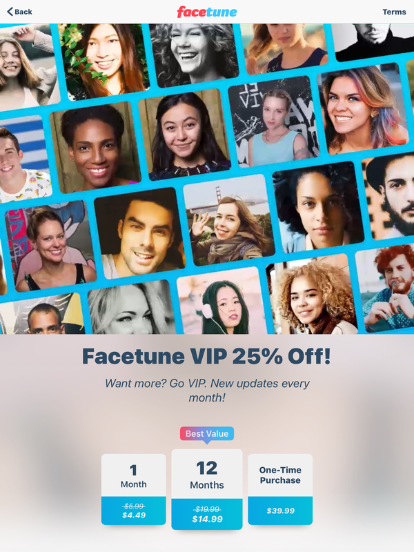
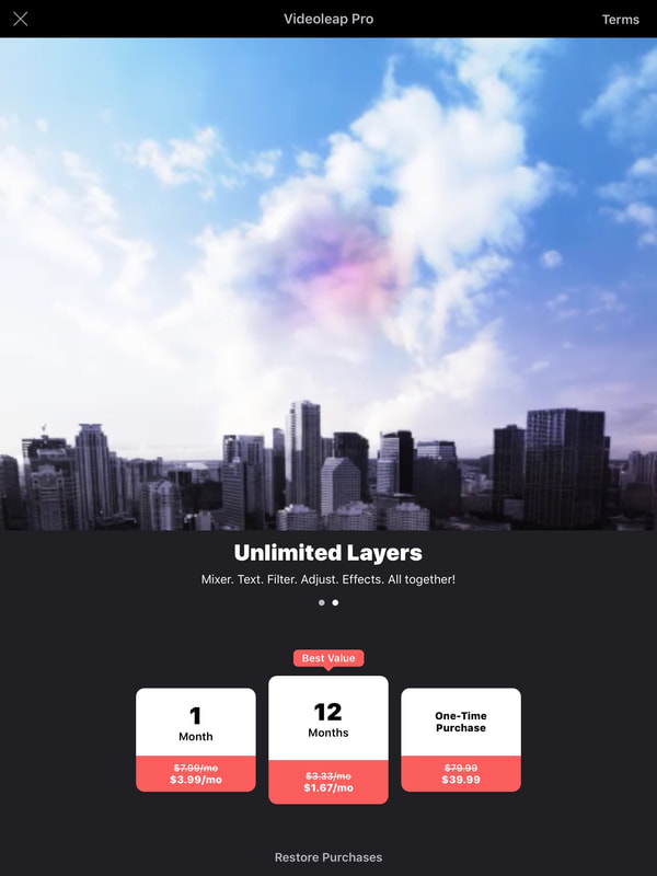
Based on this initial review, consumers appear to prefer “Education” apps that do not include subscription fees or in-app purchases. This one example is largely attributed to the success of Toca Boca, a developer who believes in creating apps for education that embody “the spirit of play,” placing greater emphasis on the non-market value of their apps. The other most notable aspect of these apps is that most of them target children. It seems highly unlikely that parents would prefer paying subscriptions to enhance their child’s educational development. There may even be something ethically wrong with such a model, if subscriptions were forced on consumers for the sake of earning higher profits. Even Apple appears to support this view of education, especially in regards to the free training sessions hosted at Apple Stores throughout the country, and also podcasts, which have remained free to the public since their inception. Apps that appear in the other categories, notably, Pixelmator and Procreate, are not all that different from the education apps; they both offer advanced features that provide great value to the consumer and they don’t come with subscription fees or in-app purchases. Since these top paid apps are successful, monetarily, what is the motivation for offering subscription fees? One can argue that the motivation is greed or it may be the stage of development that developers arrive at when striving for innovation. Lightricks Ltd, for example, are developers who have designed top selling applications like “Facetune,” “Enlight,” and most recently “Enlight Videoleap.” Their first apps, Facetune and Enlight enjoyed tremendous success, resulting in huge profits, but who decided that this is not enough. As co-founder, Itai Tsiddon, told Recode, “There is only so much innovation you can cram inside a one-time purchase… In order to create serious software companies on mobile, recurrent monetization is really a must.” Yet, Lightricks indicated that its revenue for Facetune and Enlight reached 10 million per year, not including Apple’s percentage. Lightricks argues that subscription fees will more than warrant what users get in return. In March 2013, Facetune was available in the App Store for $1.99 for the iPhone and $3.99 for the iPad version. Today, Facetune 2 is offered at the subscription rate of $4.99 for one month, $14.99 for twelve months and for the one-time purchase of $39.99. Comparatively, Enlight, a photo editor, debuted in 2015 at $3.99 and the most recent video editing app, VideoLeap, is offered at the subscription rate of $3.99 for one month, $1.67 for twelve months, and $39.99 for a one-time purchase. Essentially, consumers are paying 10 times the amount to own Facetune 2 and VideoLeap when compared to the one-time price of its previous models or 4 times the amount to lease them monthly. With Videoleap, the incentive to purchase the cheaper yearly subscription is designed to cultivate a longer term relationship, ultimately netting a higher percentage (85/15 split after one year). If Lightricks made 10 million before the subscription model, they can potentially earn 100 million or tens times the profit.
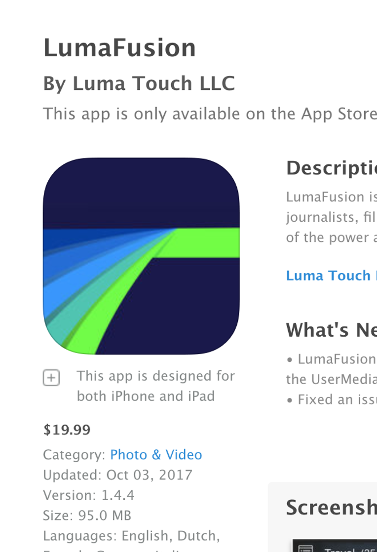
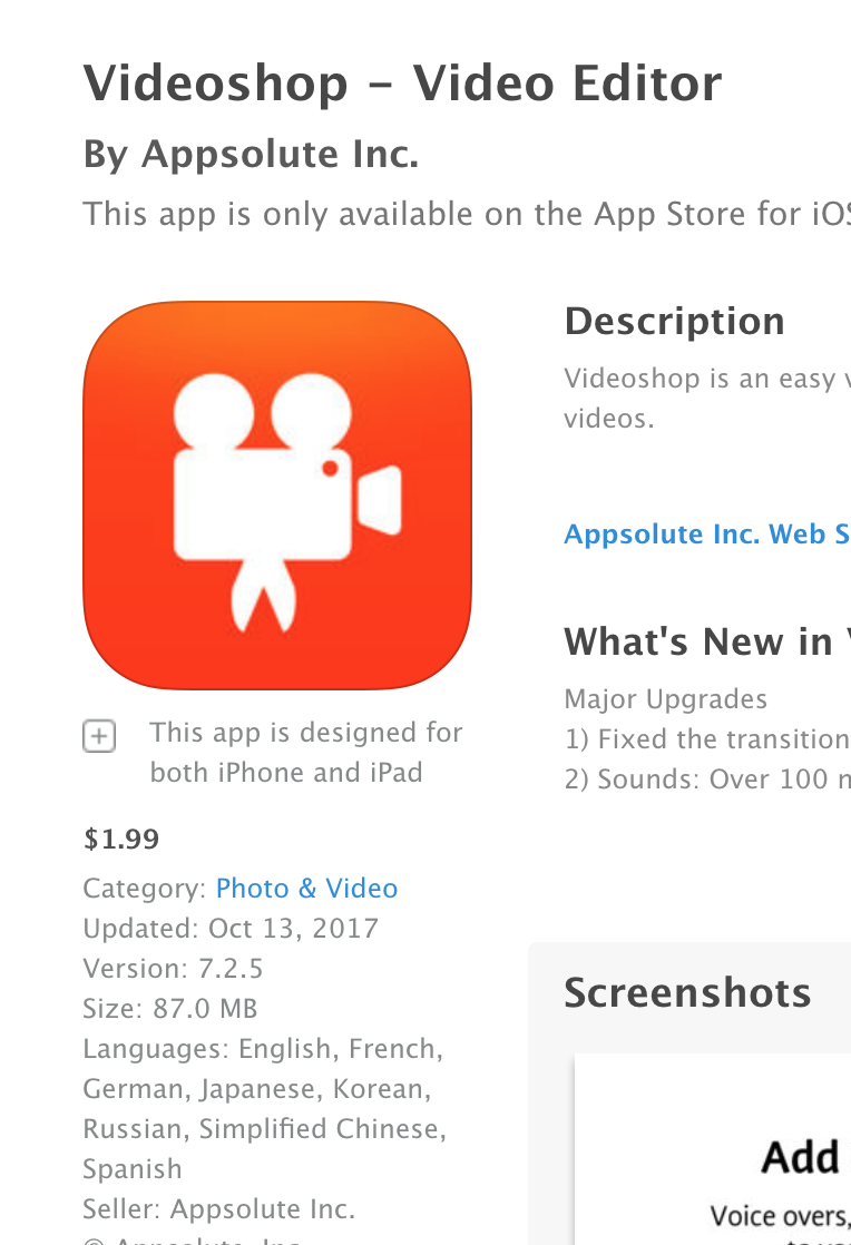
I don’t think that anyone can argue that Lightricks produces applications of the highest quality. However, is the consumer really paying for innovation or higher profits for developers (and Apple)? Applications that fall in the category of Photo/Video offer competitive prices, so consumers will be able to decide what apps (or services) work best for them. For example, Lightricks Videoleap app comes with a beautiful user interface with great features that are ideally suited for a mobile platform. There may very well be an argument to support the innovation that they bring to the mobile platform. However, Lumafusion by Lumatouch offers features that are arguably just as advanced, if not more so, and offered at the market rate of $19.99 to purchase the app outright, without subscription fees and in-app purchases. Also, Videoshop is another advanced video editor which has been at the top of the ratings for the past several years (currently rated among the top forty paid apps) and is currently available for $1.99 and comes with a plethora of features, with minor in-app purchases and no subscriptions.
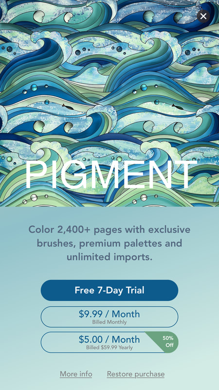
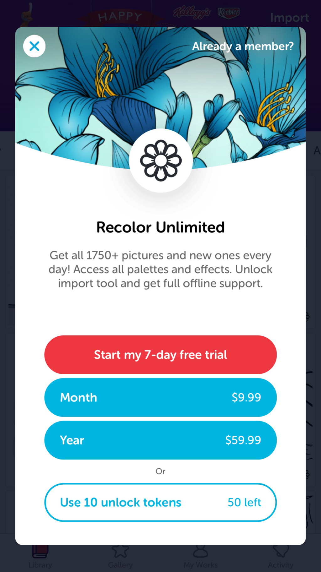
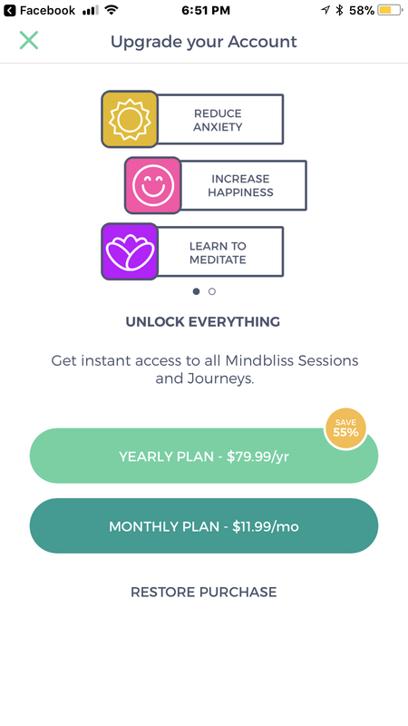
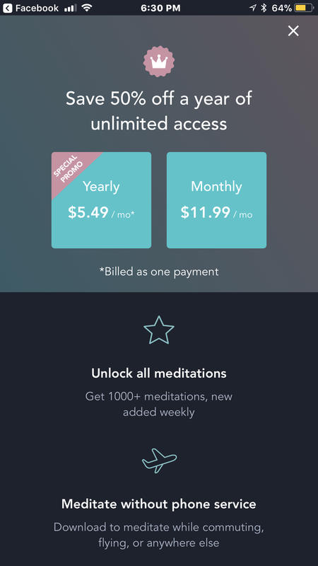
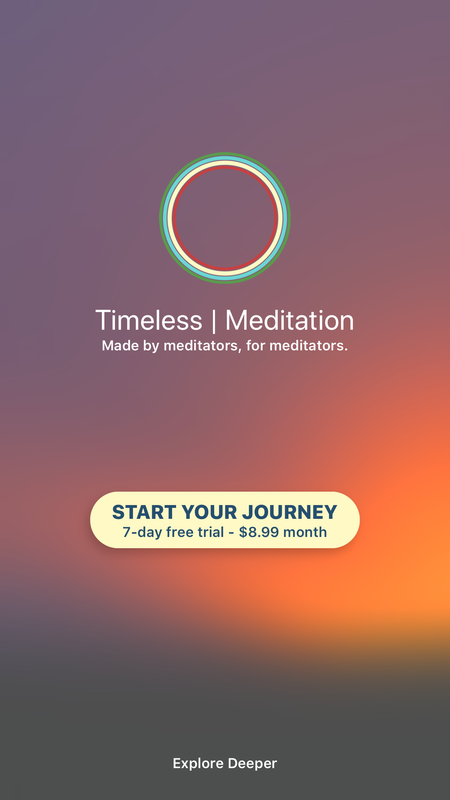
Ultimately, consumers will have to decide if they are ready financially to plunge into the subscription universe. They may need to decide very soon because this model has begun to make great headway in the App Store, specifically in markets that target adult audiences. The most pervasive evidence of apps offering subscription models are adult coloring books and health apps ranging from exercise to meditation. Below are examples of some apps that fall into those categories, although I’ve identified at minimum fifty apps in each category that offer similar subscription models.
The subscription model may very well be the wave of the future and Apple has proven to be an effective force in shaping consumer expectations. However, if the top paid apps offer any insight, consumers may ultimately determine what works best.
|
Timothy Brown
Host of My Apple Podcast. Categories
All
|

 RSS Feed