|
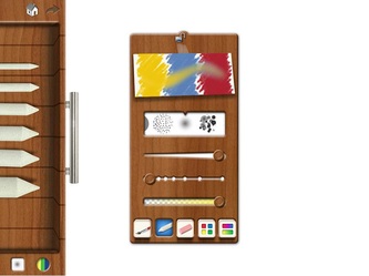
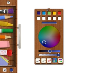
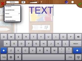
Drawing Pad for the iPad by Darren Murtha, Version 2.4 comes with 20 new features, including advanced brush textures, color wheel panel, sketch pencils, text tool, 14 new roller stamp pens; new swirl color shifting tools, gradient panel, realistic, blending, pinch zoom, canvas rotation, autosave, and much more. Check out the original review by My Apple Podcast (left) and screen shots of the latest updates.
0 Comments
"People's interest is in the product, not in its authorship." - Jonathan Ive In the tech blogosphere there appears to be an assault on what is termed "skeuomorphic design." The critics of Apple are claiming that a change is needed, so that Apple's designs can closely mirror Microsoft's - namely, creating a flatter, "cleaner" design.
Skeumorphic design has been defined by some as a stage for beginners. For example, in order to transition from an actual notepad to a digital one, skeuomophism aids the newbie in making the transition. Once the newbie has become acclimated to the new world order of design, he/she is prepared to embrace the concept of digital media, without relying on the aid of visual corollaries or digital replicas. It appears that the "Age of Enlightenment" is still upon us. The debates that have emerged from the expectations of Apple's new design for iOS 7 - with Johnny Ive now leading all aspects of design, including hardware and software - mirror the age-old debates of rationalism versus empiricism. Since design will inevitably become a visible product, the rationalists in today's debate on skeuomorphism are appealing to a design that does not occupy a purely conceptual world, but one that comes closest to it. By avoiding any reference to material things, the empirical world of notepads, calculators and turntables, we are most apt to represent concepts more effectively (In art terms Minimalism and Pop Art come to mind). Sound familiar? Unfortunately this represents a bias in design conceptions and has little to do with the practicality of design (how people use or become engaged with a product) and does not consider design in all its aspects - both two dimensional and three dimensional. Instead, we are being asked to choose a superior model over an inferior one. It should not be a surprise to anyone that this debate is engendered by the PC world, tech specialists, and Microsoft enthusiasts. Ironically, the argument for a flatter design is not coming exclusively from those who are "outside" the world of Apple, but from Apple's chief designer, Jonathan Ive. "People's interest is in the product, not in its authorship" is a quote by Ive that appears to support the rationalist argument. If people are interested in "authorship," they are not interested in pictorial details that reveal too much about the "author's" subjectivity. Design, in this sense, must be objective. I support Apple's approach to creating a more balanced integration of skeuomorphism and flat design, but I do not favor a total elimination of the former, which seems to be the argument proposed today. If Apple chooses to follow this line of reasoning, bolstered by isolated quotes from Ive, I suspect that it may be to Apple's own detriment. Skeuomorphism, I argue, appeals more to the subjectivity of the person using Apple products, and thereby aids in establishing a personal connection. Otherwise, we risk becoming an anonymous mass of automatons embracing design for design's sake. The Kantian "I" is neither objective nor subjective. And while that is clever from an intellectual standpoint, it is deleterious to the user who wants to make a personal connection to Apple products. "My Apple Podcast" is a testament to that. Steve Jobs was a genius who laid the foundation for Apple's success. Part of that success has been attributed to the successful integration of flat and sleek product designs and skeuomorphic, pictorial elegance. This integration is what has separated Apple from its competitors. If Apple departs from this approach, Apple will lose some of its originality. Kiosk Pro is the perfect application for displaying content on your iPad as a kiosk display. A great feature that comes with Kiosk Pro is the ability to add html files locally on your iPad. No internet required. Check out the video to learn more. Version 1.0.7 added the ability to invite attendees to meetings and events. Temp will also recommend other attendees and all your events can be shared and forwarded. Furthermore, you can now set up your Gmail account as your default email service for sending and receiving messages.
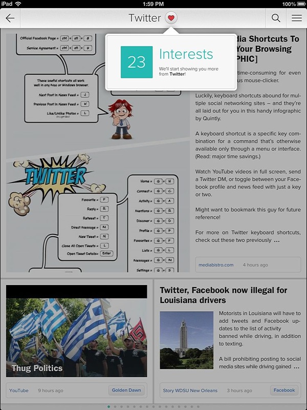
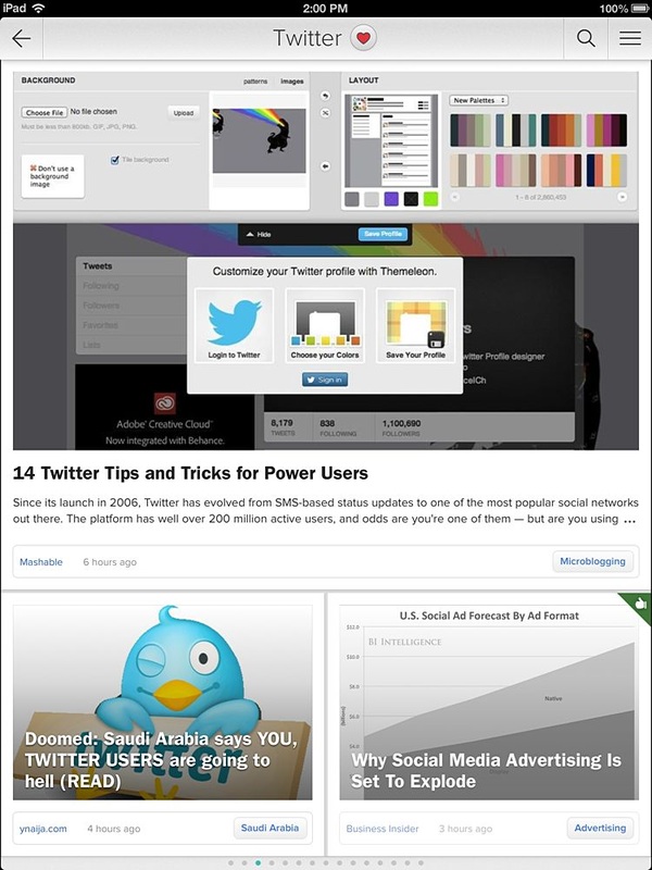
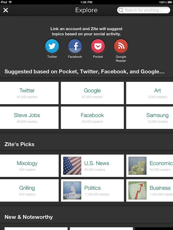
Zite version 2.3 introduces new features that take personalization a step further. Zite now improves the ability to bring you the articles you want by syncing your interests with various social networking sites like Google Reader, Twitter, and Facebook. You can also access a quick list to access your liked articles and stories now appear greyed out after viewing. You will definitely notice an expanded inventory of articles that match your interests. Check out the screenshots below.
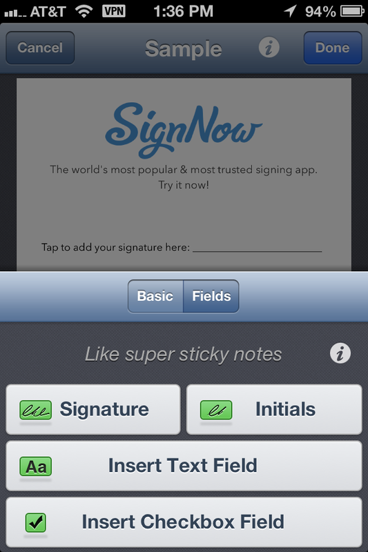
SignNow 3.1 provides improved features for team oriented documents. You can set up a shared templates folder. and keep track of all members of your team to ensure signatures needed are obtained. You can join teams and create teams. SignNow is still one of the best apps for signing PDF documents and adding form elements.
The latest 4.3 update enables you to publish and curate the music you love on Facebook, including the ability to customize what you share. You can now tap on the album artwork to view additional details about the artist. By swiping to the left, you have easier access to sharing and saving music.
|
Timothy Brown
Host of My Apple Podcast. Categories
All
|







 RSS Feed