|
by Timothy Brown Podcasts offer a convenient way to deliver digital content for free via a subscription to a web feed, and Soundcloud provides a cloud-based delivery system for streaming audio content straight from a browser. Actually, Soundcloud provides a way to do both. Before I begin, let me provide you with a little background about podcasting. iTunes and Podcasts
Not surprisingly, Apple played a key role popularizing podcasts, and podcasters like Adam Curry, otherwise known as the "podfather," was one of the first to use the technology. iTunes was introduced at Macworld on January 9, 2001, after Apple purchased SoundJam MP, from the developers (and former Apple employees) Jeff Robbin, Bill Kincaid, and Dave Heller. On June 28, 2005, Apple introduced iTunes version 4.9 which offered built-in support for podcasts. What exactly is a podcast?A podcast is a form of digital media (audio, video, digital radio, pdf) that is presented in a series and streamed online to a computer or mobile device. The podcast producer maintains a list of digital files or assets on a server as a web feed that can be accessed by third-party software like iTunes, which functions as a directory for accessing the podcasts - otherwise known as an “aggregator” or “podcatcher.” Web feeds are set up using RSS (Really Simple Syndication), an XML file format that ensures compatibility with many different computers, devices, and programs. RSS feeds enable users to subscribe to audio and video recordings and receive them in a series, automatically, removing the need to manually check the website for new content. For example, when you open iTunes on your computer, you will find podcasts as a menu option, alongside music and movies. When you access podcasts from the iTunes Store, you will find a directory of podcasts that you can browse by categories, including highlighted sections like “new and noteworthy” or “featured collections.” SoundcloudSoundcloud was established in Berlin in August 2007 by a Swedish sound designer Alexander Ljung and Swedish artist Eric Wahlforss. Soundcloud provides an online resource for accessing music and audio recordings directly from a browser. Content producers are provided with individual channels that users can follow, like, repost, and add to customized playlists. Soundcloud can be accessed through a mobile application, which makes it easy to stream recordings from a smartphone. Content that is distributed through Soundcloud can also be shared and distributed through other websites using a code embed option, enabling content producers and consumers to feature songs and playlists across the web. I guess you can say that Soundcloud is like Flickr for audio streaming. Soundcloud and PodcastsSoundcloud provides a convenient way for combining its cloud-based service for hosting and delivering audio content with podcast technology, which automatically delivers content to you. For example, music and audio recordings that are set up on a channel or in a playlist can be selectively added to a RSS feed that is generated by Soundcloud. Soundcloud generates a unique url or RSS feed that can be submitted to “podcatchers” or directories like iTunes. The podcasts or audio recordings are accessed through various applications, including Podcasts by Apple, Overcast, Downcast, Stitcher Radio, and Podcast Addict, to mention a few). SummaryThe marriage or integration of Soundcloud with podcast technology helps to provide broad access to audio recordings, most of which are free to consumers. Content producers that are interested in using Soundcloud as a delivery system have the option to sign up for a Pro account at $6 a month or a Pro Unlimited account at $15 dollars a month, if they prefer to have advanced access to analytics and web statistics. If you are unfamiliar with podcasting, I recommend that you visit iTunes and explore the directory of podcasts, or check out Apple’s Podcasts application, which comes pre-installed on iPhones. Likewise, if you are unfamiliar with Soundcloud, visit soundcloud.com, search Soundcloud’s directory, download the Soundcloud application, and/or start your own Soundcloud account. You will discover a whole new world of content right at your finger tips. This article was written by Timothy Paul Brown, host of My Apple Podcast
0 Comments
Since the release of iOS 7, Apple introduced radical new changes to iMovie for iOS and the Mac. The new version came with a sleek minimalist design, and a comparative list of features for a more continuous experience. Titles, themes, and transitions began to have the same look and feel and the interfaces from the iPad surface to the computer trackpad were barely distinguishable in terms of ease of use. However, the steps toward a more unified experience have been slow and incremental. Steadily, we witnessed improved performance with iCloud and enhanced editing features like the inclusion of new filters. Yet, in spite of the gradual improvements, Apple had yet to offer the ability to share projects between iOS and the desktop. Until now.
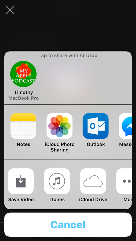
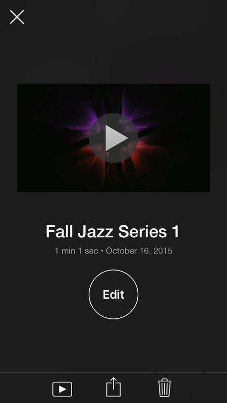
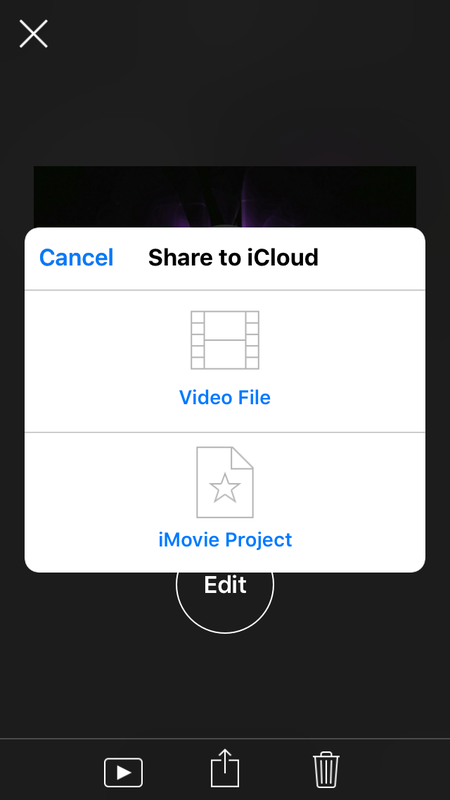
iOS Meets OSWith the latest upgrades to iMovie, projects created on your iPhone and iPad can now be accessed and edited in the desktop version. This is a significant development. Inside the iOS version of iMovie, you will notice some subtle changes. When you select the share button beneath your iMovie project, you will find several options: "Save Video," "iTunes," "iCloud Drive," and "AirDrop." When selecting the last three options, you can either export your video or save your project to these locations. You are therefore given three options to access your project files, so that they can be imported into the desktop version of iMovie. The new iCloud application, now available for iOS, is arguably the greatest asset for improved accessibility and integration. The only limitation is the lack of reciprocity. Projects created with the desktop version of iMovie cannot be imported to the iPhone or iPad–at least, not yet. The desktop version still offers additional features (adjustment tools, backgrounds, etc) that are not available for the iOS version. Nonetheless, If you love iMovie or you are new to Apple's longstanding video editor, you will love the new update, which promises to be an enjoyable user experience. 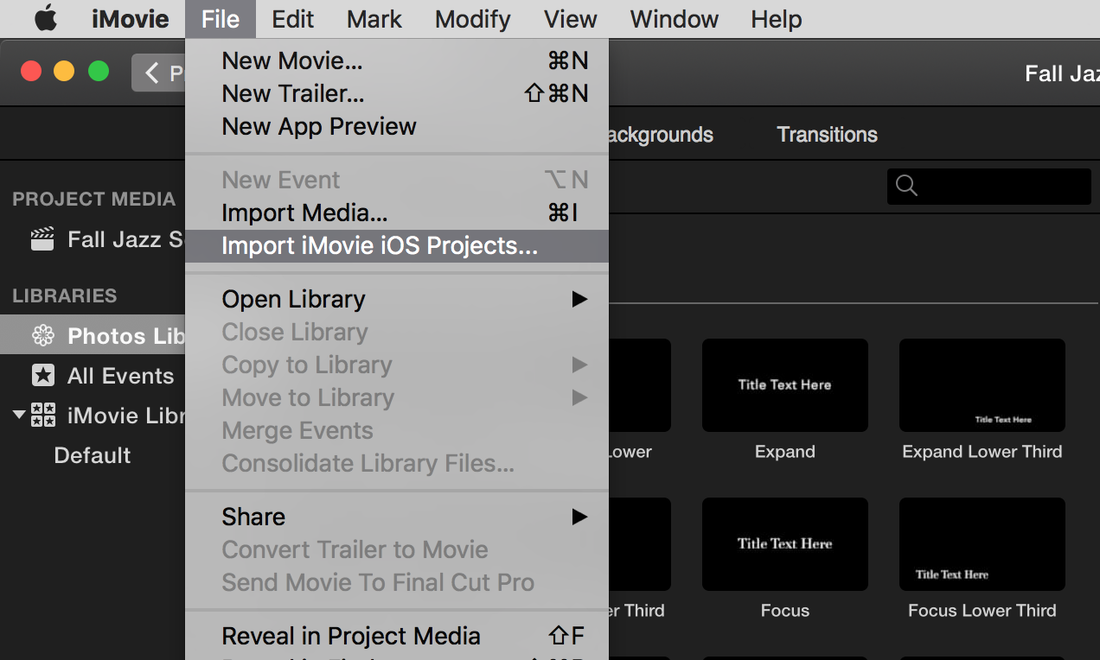 You know, I just realized something. I seem to spend a lot time focusing on iOS but today, I’m going to focus on the Mac, more specifically, a photo editing application for the Mac called PhotoScape X. I chose PhotoScape X because it’s an application that contains a boat load of features, what you might call an all-in-one desktop photo editor. When you first open the app, you will find a menu of options along the top: Photoscape X, Viewer, Editor, Batch, Collage, Combine, CreateGif, Print, Tools, and Store. Combined, this menu comes jam-packed with a lot of functionality. 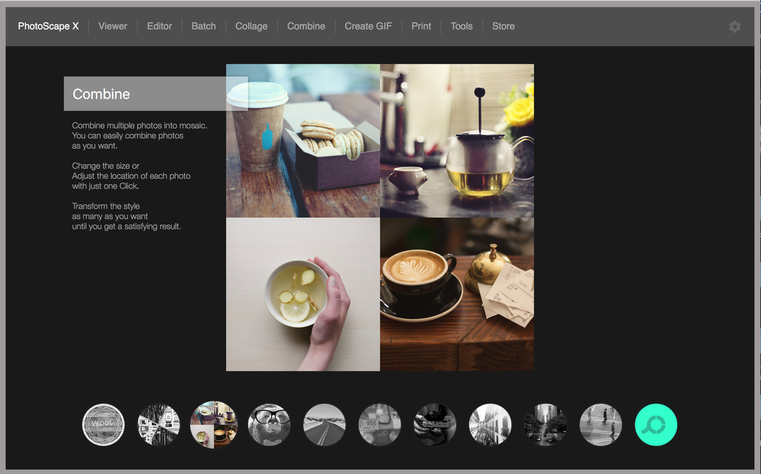 PhotoScape XRunning your cursor across the corresponding thumbnails along the bottom, you will get a glimpse of the wonderful features that come with PhotoScape X: Shape and Text, Collage, Combine, Sticker and Frame, Point Color, Cellophane, Film Effect, Light Leak, Miniature Effect, and Illusion and Reflection. This section is mainly an overview of what you can expect when you delve deeper into this amazing application. ViewerThe Viewer, simply put, is where you can view all the photos accessible on your Mac - not only what you see, but how you can view them. For example, you can view them in tile view, list view, and/or full screen. When you click on the drop down menu at the bottom right, you can organize files, alphabetically, by size, date, and so forth. You can also use the slider along the bottom to control the size of your thumbnails. The Settings icon provides some additional hidden gems. For example, you can customize your view by filling the thumbnails, or showing the file name, number, and frame. You even have the option to tilt images so they appear less uniform. 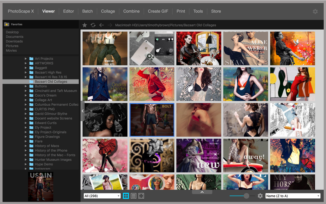 EditorUnder the Editor, you have access to your images on the left, and on the right, you have a range of menu options: Edit, Adjust, Film, Effect, Frame, Insert, and Brush. This menu is the most extensive, with a plethora of effects and alterations. Edit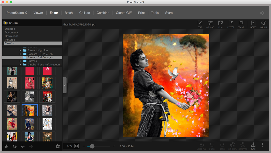 Edit is where you can make adjustments to the structure of your image, including Crop, Resize, Flip Horizontal, Flip Vertical, Rotate CW, Rotate CCW, Rotate (general), and Straighten. All of these features are pretty straightforward, but let’s take a closer look at the Crop and Resize options. Crop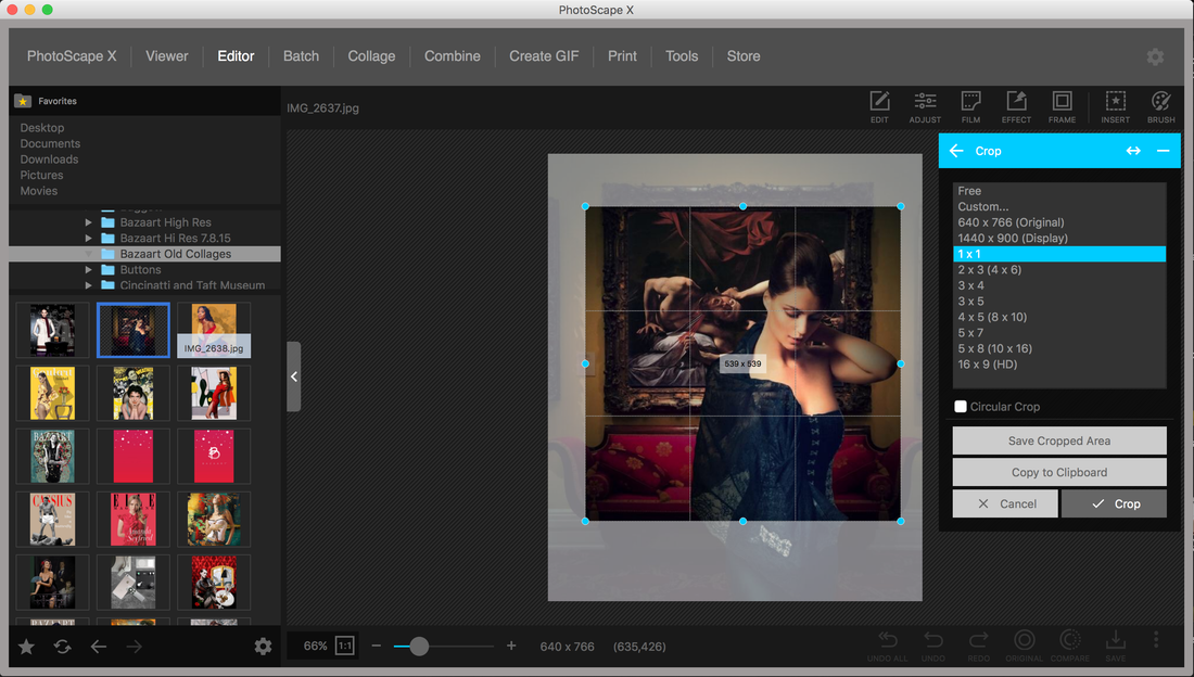 When selecting one of the aspect ratios, say 1:1 or square format, the cropping tool will automatically take on the form of a square. The same occurs when you choose 16:9. A unique option includes the ability to add a circular crop, which can then be used to add a color, pattern, or transparent background. ResizeThe resize tool enables you to increase the pixel dimension of your photo, with options to preserve the aspect ratio or to adjust the size manually by 300 percent. AdjustThe adjustment tools in PhotoScape X are what you would expect to find, the ability to control brightness, color, levels, curves, color balances, sharpen, blur, and white balance. Color Emphasis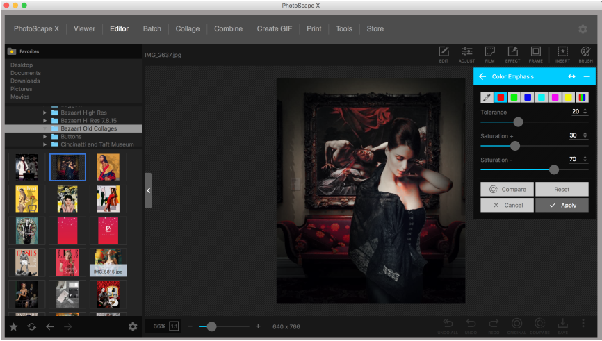 Color emphasis is how you can control point color. For example, you can select one of the color swatches to decide what color you want to emphasize; the rest of the photo remains neutral. For better control, you can use the eye drop tool to pull a color directly from the photo. You will notice throughout the option compare your changes to the original photo. FilmStill under the Editor menu is the option to add Film Effects. Here you can select a long list of thumbnails, each one representing a different film overlay; the slider along the bottom allows for further refinements. The Film Menu also includes Duotone and Light Leak options. Duotones appear monochromatic, but have hints of warm and cool colors reminiscent of different film processes. Light Leaks are quite common among photo editors, but in PhotoScape X, you can make further adjustments by using the tools below to flip and/or rotate the effects. Effects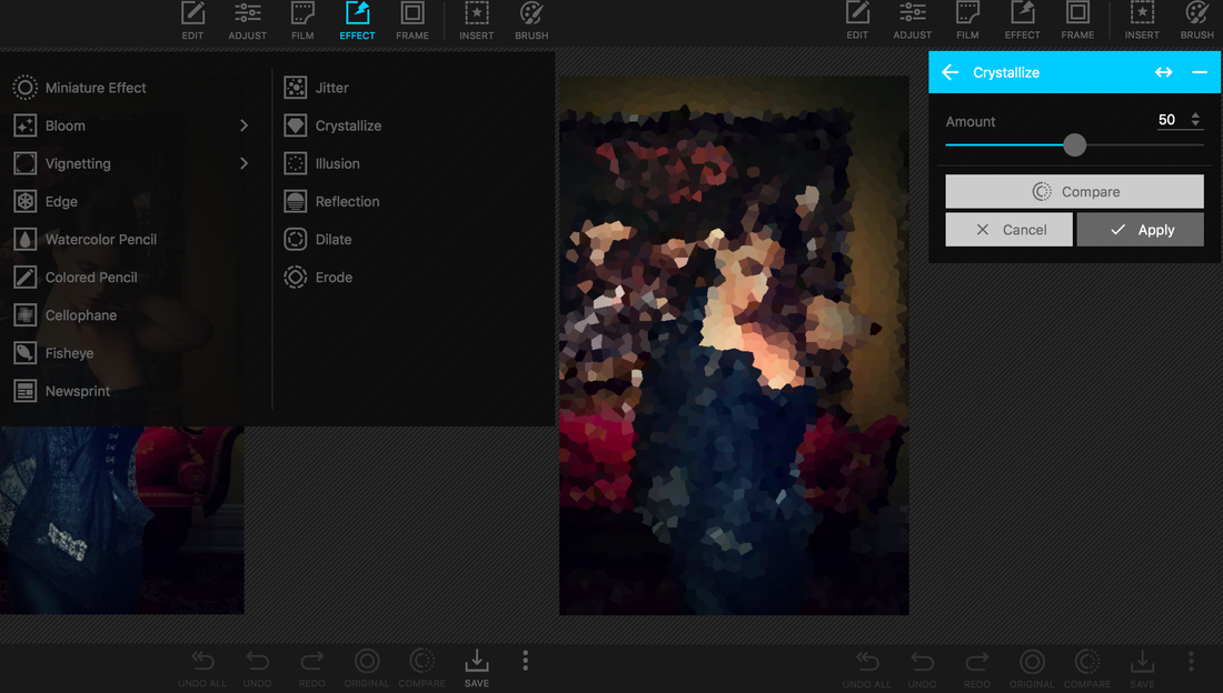 The Effect tab goes beyond film replications. The Effects include Miniature Effect, Bloom, Vignetting, Edge, Watercolor Pencil, Colored Pencil, Cellophane, Fisheye, Newsprint, Jitter, Crystallize, Illusion, Reflection, Dilate, and Erode. Miniature EffectThe Miniature Effect is what is commonly referred to as “Tilt Shift.” By tilting the focus of your images, you can isolate the focus on certain parts of your photos, while blurring the rest. As you will find in common applications like Instagram, you have a radial and linear option. CrystalizeCrystallize enables you to break your image into cubist abstractions, ranging from fine and minute rearticulations of the image to larger more abstract forms. Frames The Editor Menu also includes the ability to frame your images, with a subset of menus that include Frame, Shape, and Border. What I find most impressive is the extensive menu of options, and the ability to add colors, patterns, and transparent backgrounds. InsertThe Editor Men also includes the ability insert stickers, Images or logos, text, and various annotation markers. Each additional element that you add to your photo can be removed by clicking the “X.” An inspector menu enables you to customize colors, opacity, and line types. Brush ModeI found the brush menu to be surprising, and refreshing. For example, when you select painting at the top left, a long list of options appear, which you can brush onto your photo, including the ability to paint, add greyscale and sepia tones; brighten, deepen, darken, blur, defocus, clear skin, or apply mosaic effects. You can also correct red eye, remove mole, and/or clone sections of your photo. BatchPhotoScape X also comes with a Batch feature. Essentially, you can import multiple photos, and make adjustments to all of them at the same time. These adjustments include resizing, adjusting lighting, contrast, and clarity of the images, adding effects and even adding frames and shapes - all of this done to multiple photos at the same time. Collage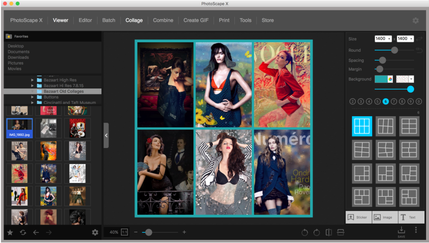 Another feature that typically comes in the form of a stand-alone app is the Collage feature. Rather than provide this feature as a simple add-on, PhotoScape built in a full-fledge collage creation tool. As you can see there are so many templates at your disposal that your options are limitless. Not only do you have ten menus to choose from, but each collage comes wth the ability to customize the size of the collage, control corners and margins, adjust colors, as well as, customize backgrounds. You can also add layers in the form of stickers, images, and text. Wow!! CombineCombine is another menu option that is a variant on the collage feature. For example, you can import multiple photos and combine them, either in vertical and horizontal displays or in tile view. Furthermore, the combo feature comes with the same adjustment tools as the collage feature, refining the margins, rounding the corners, adding a background color, and changing the canvas size of your final export. Think of how handy this feature could be when updating header images for your social media pages or personal websites. Animated GifsWith PhotoScape X, you can also create Gifs. I kid you not. And the features are quite impressive. Let’s take a look. Select a group of images from your library and drag them onto the stage. On the righthand side, you will find several ways to customize your Gif. By default, each image will begin to flash at intervals of 0.50 seconds. You can easily change this by selecting “Change Time” and then “Change All Frames.” “No Effect” is selected by default, but you can change this by clicking on “Change Effect” and adding the “Slide” transitions” or “Fade” and “Zoom.” Text can also be added to your Gif, including the ability to control the size and position of the text. Print is the next menu option. This seems pretty straight forward at first, but on closer inspection, you will notice that even this feature comes with levels of customization that you would not expect from a photo editor. From the this menu, you can select the printer, paper size, portrait or landscape, and/or print a portrait shot or thumbnails. You can choose paper or image full, even select the DPI, ranging from 72 to 1200. ToolsI know what your thinking. Have I moved on to another application or am I still describing PhotoScape X. Trust me, I thought the same thing.
Next on the Menu bar is “Tools.” Here you can take screenshots, which can import into PhotoScape X, select a built-in color picker, and rename files in bulk. And last, but not least, the Store enables you to upgrade to the Pro version and/or buy additional stickers and photo decorations. And that is PhotoScape X, the all-in-photo editor for the Mac. Check it out. The app is free (which is absolutely crazy), but comes with in-app purchases, if you want to upgrade to pro, and that is exactly what you should do because this app is amazing!!
Matter by Pixite LLC is an application for iOS that enables you to create stunning photos and videos with 3D objects. Consistent with the quality of applications that make up Pixite's repertoire (Fragment, Union, Lorey Stripes, Shift, and Tangent), Matter is highly original, creating 3D objects in the form of organic, geometric, architectonic, and modular configurations that will heighten your imagination.
The Structure of Matter
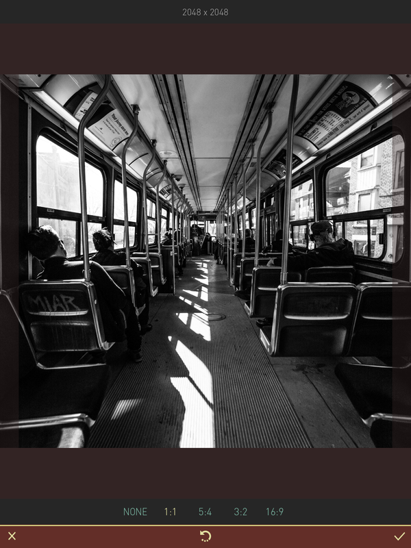
Matter is a universal application that comes with built-in rotations, making it easy to work in vertical or horizontal formats (rotation is only made for the iPad, although this may be available for larger iPhones as well). Upon opening Matter, you will be prompted to import an image from your library, use the camera to take a picture, or browse through Pixite's vast inventory of images. After selecting an image, you will be given the option to choose an aspect ratio for your composition (1:1, 5:4, 3:2, or 16:9) or you can choose "none" to keep the default dimensions.
The Tool Bars
The toolbar is comprised of three horizontal bands, consisting of menus and positioning tools, 3D library, and adjustment tools. The top layer contains a menu icon for accessing 3D collections that range from "Primitive Objects" to "Future Machines" (some of which are acquired through in-app purchases). The tools adjacent to the menu option enable you to quickly rotate and re-position objects. The second layer is where you access the library of 3D objects that coincide with the particular portfolio or inventory you have selected (e.g. "Forms in Orbit)." The bottom layer provides four menu options for making adjustments and enhancements to your 3D objects, including the ability to add styles, shadows, and/or apply masks.

Main Toolbar
Matter also provides additional tools for making adjustments to animations that will be included in videos. For example, when you select the triangle icon at the top right corner, the "video" button will bring up another menu of tools. The tools enable you to adjust rotations of your object, vary the pace or speed, and/or add pulse and hover effects,

Video Toolbar
Added Feature
Introduced in Version 1.3, Pixite offers the ability to add music to your 3D animations. Soundtracks are not uncommon, but the makers of Pixite designed this feature to influence and inform the movement of your 3D creations. Choosing from a menu of tracks that range from "club" and "funk" to "lounge" and "martini," objects that rotate in space form unique motion paths in accordance with each song. You can even import songs from your iTunes library (I recommend DRM free samples, not the songs you purchased from iTunes).
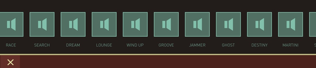
Song Library
Exporting
At first glance, the exporting option appears generic and straight forward. Consistent with most photo/video creation tools, you have the option to save, share, share to Instagram, and open in other applications. However, the export option also comes with the ability to add additional objects. For example, once you have added a 3D object and you've made all the necessary adjustments, you can add another 3D object or element on top of an existing one. Considering the variations that are at your disposal, layering various 3D objects can produce complex and surprisingly original results. When using this feature with video. the previous animation will become static, merging with the original photo, allowing for new animations to emerge.
Matter is arguably one of the most original applications available for iOS. The photos and videos you create will impress and inspire your friends and colleagues. If you would like to see Matter in action, check out my video review below. Note: The introductory video for this episode was made with Matter.
Author: Timothy Paul Brown, Host of My Apple Podcast
One year after Apple purchased Beats Music for 3 billion dollars, the tech giant released Apple Music, the tech company's major leap into the music streaming business. Since its inception, iTunes epitomized the way people consumed music, but the successful streaming models presenting by Spotify and Pandora led to a new paradigm shift, and to Apple's entirely new approach to music delivery.
AUDIO PODCAST
On a larger scale, the transition began with Apple's iCloud service, which laid the foundation for cross-platform integration, OS X and iOS. Introducing iTunes Match in 2011, Apple customers began moving their music into the cloud, laying the seed for Apple's giant leap into the streaming music industry. The current three-month trial period for new Apple Music subscribers functions as an open door that will become for many of us an endless sea of musical opportunities. What is most impressive is the design, the way Apple manages to present a multitude of content across multiple platforms in a consistent and visually appealing manner (see diagrams below). Let's take a closer look at Apple Music.
The Continuous Experience
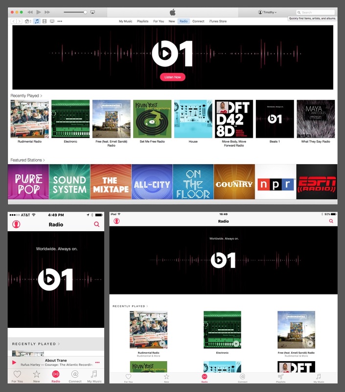
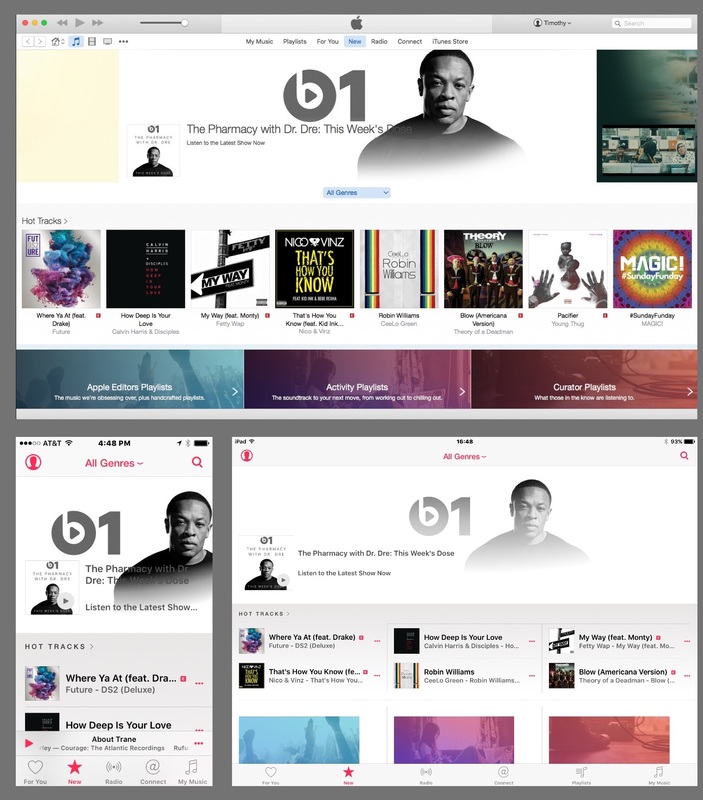
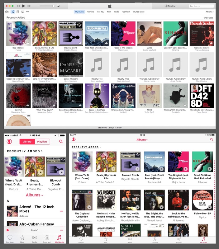
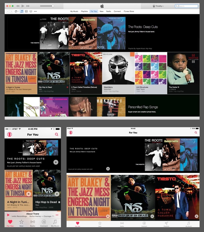
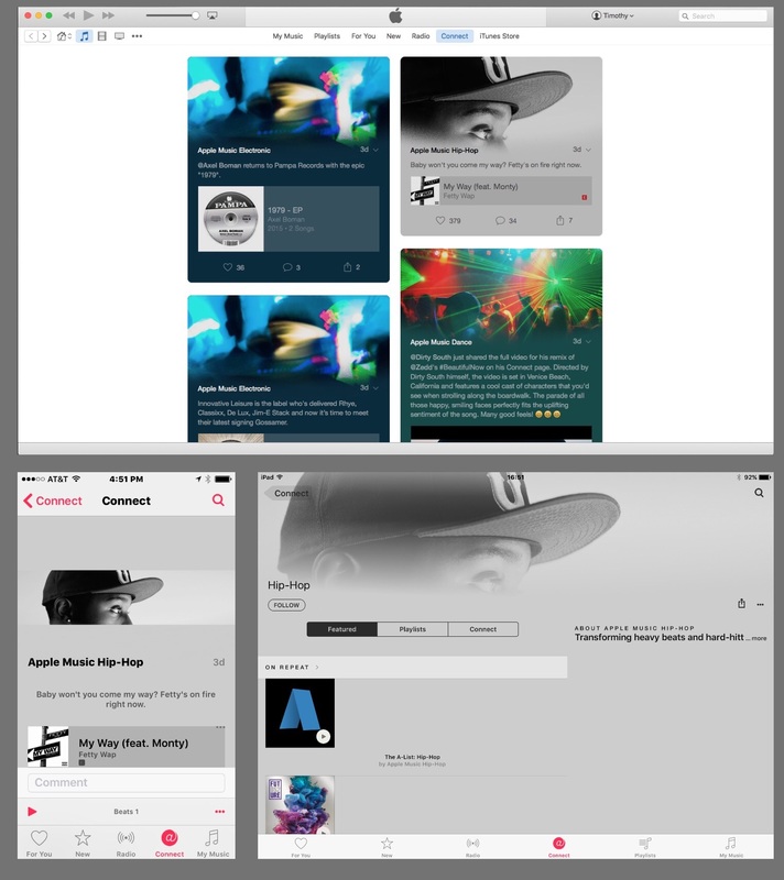
Apple's iCloud service provides a central locus for how we access - well, everything! Everything we own, applications, music, data collection and Siri integration, can now be accessed and synchronized across all Mac computers and iOS devices. The seamlessness of this integration is what led to the inevitability of Apple Music. Whether you are on a Mac computer or iOS device, the Apple Music experience is now continuous, codified by five major sections: My Music, Playlists, Connect, Radio, New, and For You.
My Music
My Music is literally your music, a concept that has been greatly expanded with the full integration of streaming music. The foundation for this development was established with iTunes Match, which enabled users to upload CD content and other digital files right into the cloud to be integrated with songs purchased through iTunes. The "actual" possession of digital files reinforced the idea of a certain proprietary sense of ownership, but with music now stored on Apple's servers, the emphasis is placed less on ownership and more on services. Once you invest in Apple's new streaming service, access to music will become endless and ownership will take on an entirely new meaning.
New
Once you have invested in the streaming music model, every song you discover in iTunes is yours for the taking. New Music, for example, is where you can access new releases by leading artists today. Future, by DS2, is one album you may discover in this section. If you happen to be drawn to Where Ya At, featuring Drake, tap on the three dots and select "Add to My Music" and, voilà, the song is added to your library. It's that simple. You are no longer required to pay $10.99 for the complete album or $0.99 for a single. Ownership and possession of music takes on a whole new meaning in the streaming business, and Apple is ideally situated to deliver this kind of service. If you still prefer products over services, the iTunes store is still available for those who want to physically own the digital file. However, the dichotomy between streaming and file ownership is blurred. For example, with every song you add to your music library, you have the option to "Make Available Offline." This option is equivalent to downloading or "owning" the actual file. For example, I discovered Yesterday by The Black Eye Peas and added the song to My Music. On my Mac, I control-clicked on the file and selected the option to view offline. I control-clicked once again and discovered the option to "show in finder," evidence that the actual file was now in my possession.
Radio
And you thought radio was dead. With Beats One, Apple may have single handedly revived the radio business. Beats One is Apple's greatly expanded initiative that took iTunes radio and made it live. A twenty-four hour radio service, Apple features qualified radio hosts who are scheduled to appear live throughout the day. Surprisingly, a beautiful display of the Beats One schedule can be found on Tumblr, where you can find the leading radio hosts, Zane Lowe, Ebro Darden, and Julie Adenuga who top Apple Music's line up. Check them out! You will be impressed! In addition, the radio section also provides a wide menu of stations classified by various music genres (Country, Hip-Hip, Dance, Pop, Electronic, Rock and Blues, and Alternative), to list some examples. Radio stations can also be created from any song that is found in iTunes, a feature that was first introduced in iTunes Radio. Are you lamenting your stations formerly set up with iTunes Radio? No worries. They are still available under "Recently Played."
Connect
Connect is Apple's way of integrating social media into the music listening experience. Apple's first attempt to get social was introduced with Ping in September 1, 2010, a feature built into iTunes but which never took off. After two years, Apple cancelled the service and replaced it with Facebook and Twitter integration. Connect is a bit difficult to grasp, but this initiative has a lot more promise than it's earlier initiative. The future success of Connect will derive its impetus from the overall effectiveness of Apple Music as a whole, creating a wholistic and total music experience. Connect is a collection of playlists designed by Apple's D-Jays, classified as Apple Music Dance, Apple Music Hip-Hop, and Apple Music Electronic, to name a few. These playlists are distinct from your playlists, functioning primarily as a way to highlight Apple's own initiative in this area. Listeners can choose to select the heart symbol to show their support, leave comments, or share on social media.
For You
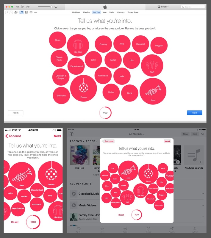
For You is Apple's way of customizing your listening experience. Those of you who are used to the iTunes experience, customized songs and playlists have long been a part of the Genius option. For every song that was purchased through iTunes, Apple would offer recommendations of other songs that matched your song choice. With the advent of Apple Music, songs that are recommended For You acquire a much stronger degree of personalization, a process that begins under your profile. In the top left corner of the music app, you will find a portrait icon. Click on this icon and select "Choose Artists For You." Under the heading "Tell us what you're into," you will be greeted with an array of floating red bubbles with the names of artists, genres, and pictorial icons, Press once if you like them, press twice if you love them, or press and hold if you don't like them. The size of the bubbles will reflect your music preferences. Your selections are revealed under the heading "For You," in the form of additional playlists that more closely align with music you have in your library. For example, I have a strong collection of hard bop and progressive jazz albums, which resulted in numerous playlists that feature my favorite musicians, John Coltrane, Sonny Rollins, and Eric Dolphy. I used to enjoy the genius feature in iTunes, but this feature is infinitely better.
Conclusion
Apple Music is an impressive music service with tons of musical resources at your disposal. At first, you may feel confused or overwhelmed. This is to be expected. Apple has simply exceeded our expectations, providing a complex array of features that would typically be rolled out over time. So often, Apple is criticized for how long it takes to introduce new features. With Apple Music, the company exceeded our expectations. In my estimation, Apple should receive credit where credit is due. Apple Music is an ambitious attempt to take the music industry by storm, and with Apple's first break-through into the streaming business, they knocked this one out of the park.
During the 2015 World Wide Developers Conference (WWDC), Apple introduced new features and updates for Mac OS X (EL Capitan), iOS 9, and the Apple Watch. Overall. the announcements were aimed at improving experience and performance. Apple Music, the company’s new venture into the streaming business, was highly anticipated, following last year’s purchase of Beats Music, but the announcement that garnered the most surprise was Apple News. In order to understand the significance of this development, it is worthwhile revisiting Apple’s earlier developments in the areas of software and cloud-based services. When you consider Apple’s long and productive history, there is one service that has stood the test of time: iTunes. iTunes was introduced at Macworld on January 9, 2001, after Apple purchased SoundJam MP, acquiring as well the developers Jeff Robbin, Bill Kincaid, and Dave Heller. Without a doubt, iTunes transformed the way consumers purchased and downloaded music. Yet, fours years later, Apple introduced another feature in iTunes that would deliver news and educational content from major news organizations and individual bloggers: Podcasts. "Podcasting started out as wayne's world for radio" - steve jobs Podcasts On June 28, 2005, Apple introduced iTunes version 4.9, which added built-in support for podcasts. Users could submit podcasts to iTunes through an RSS feed, incorporating album artwork and a special section in iTunes for browsing content. iTunes functions as a vehicle or aggregator for generating the content, and presenting it in a user friendly and visually appealing manner. When Steve Jobs presented this new iTunes feature on AllthingsD, he stated that "podcasting started out as Wayne's World for radio." The significance of offering podcasts through iTunes, continued Steve, was to make this medium more accessible by subscribing to them and getting updates to those feeds automatically. Today, podcasts are still very popular, buttressed by iTunes U (introduced on May 30, 2007) and the Podcasts App (released during the summer of 2012 in anticipation of iOS 6). Unlike the music store, the most significant feature of podcasts is that the service is FREE. 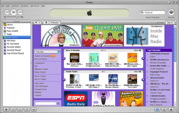 While podcast RSS feeds, and associated assets, are stored on the users web server (not Apple’s), Apple was slowly developing ways to provide cloud hosting services to enhance the user experience. On January 10, 2006, Apple introduced iWeb during the Macworld conference and Expo. iWeb, part of the iLife suite, was a WYSiWYG website creation tool that enabled you to set up web pages with an easy drag-and-drop interface, including podcasts and a RSS feed that could be published through iTunes. 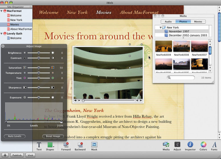 Apple began their journey into cloud-based services through the introduction of iTools (introduced January 5, 2000) .Mac (introduced on July 17, 2002), and followed by MobileMe, introduced on July 9, 2008. With iWeb receiving support through Apple’s MobileMe cloud service, the future seemed very promising, as technology trends began to place greater emphasis on the Cloud as a cost effective and productive way to produce and share content. In general, the success of cloud-based services grew so quickly that it became burdensome for companies like Apple to become wedded to particular services and applications. It soon became apparent that everything could be stored in the Cloud (photographs, music, videos, web content, and data), a code-word for server farms with massive potential for storing digital assets and information. With its eyes on the future, Apple suspended iWeb on June 30, 2012, with plans for using cloud-based services to integrate all content consumed and produced by Apple computers and devices. On January 27, 2010, Apple introduced the iPad, along with the e-book application, iBooks. iBooks became an application for accessing digital books from the iBook Store, but users also had the ability to sync personal EPUBs and PDFs through iTunes synchronization. Moving from product creation to product consumption, iBooks offered the greatest potential for accessing published content, entering a market dominated by Amazon. The demise of iWeb was also anticipated by the introduction of iBooks Author on January 12, 2012, a publishing platform that enables the user to create interactive books, including slideshows, audio, video, 3D graphics, maps, html content, quizzes, vocabulary terms, and beautiful templates adapted to a range of subject matter. Highlighted as a special “education event” in New York City, the introduction of iBooks Author appeared to catapult Apple into the sphere of cloud-based publishing that successfully combined content creation with consumption.  On the heal of this extraordinary announcement, the Justice Department began procedures to investigate a price-fixing scheme involving Apple Inc. and five major book publishers. This development became a huge blow for Apple, resulting in millions of dollars in restitution for consumers, and a huge win for Amazon, who continued to offer discounted rates for e-books. iBooks Author, arguably the most innovative publishing tool available for the Mac (or any computer), slowly receded from public recognition. Furthermore, Apple’s ambition to provide cloud-based services that incorporated product creation with increased accessibility for consumers (most importantly educators) received another blow when the Los Angeles school district suspended its use of iPads as a curriculum-based tool for students and teachers. Laying the Foundation Today, iCloud is now used to back up all content and data associated with Macs and iOS devices. As a central portal for storing and accessing information, Apple can now introduce new products and services with greater efficiency, enhancing experience and performance. Now entering the most mature phase of its development, iCloud, along with Apple’s superb team of designers and developers, provides the perfect foundation for Apple News, a new publishing platform scheduled to be released this Fall. Apple News: The Dawn of a New Day With Apple News, Apple has the potential to combine many of the features associated with its previous initiatives into one platform. The popularity of news readers like Flipboard are heavily dependent on RSS feeds to deliver content to subscribers in a way that far exceeds proprietary platforms. Apple has long recognized this potential through its commitment to podcasts as a free tool for publishing news and educational material in the form of audio and video content. In contrast to the way podcast feeds interface with iTunes, with content and feeds stored by third party services, through Apple News, Apple will enable users to manage RSS feeds and related assets right through iCloud. As a result, businesses, as well as, individual bloggers, will have the ability to create and publish content, combining the delivery of podcasts with the technology that gave rise to iWeb, iWork, and iBooks Author. Apple News: A Challenge for Competitors Apple News presents a huge challenge to its competitors by excelling in areas they have yet to fully develop. In general, news readers enable iOS users to save and organize content generated by RSS feeds. The feeds can be organized by categories, enabling the user to save articles locally within the app or to third party services like Instapaper, Readability, and Pocket. The most successful news readers provide access to content across a range of subject areas, customized content, functional and intuitive user interfaces, and something unique that separates them from their competitors (such as grid layouts and flipping and swiping gestures).  Since the inception of the iPad, the dominant news readers have been Flipboard, LinkedIn Pulse (formerly Pulse), USA Today (one of the first news apps for the iPad) Early Edition 2, Zite (purchased by Flipboard), Feedly, Prismatic, News360, Something, NPR News, and Paper by Facebook. All of them provide a range of content, customization, dynamic interfaces, and something unique that sets them apart. Flipboard, the most prominent among news readers, provides a feature called “My Magazines,” which enables the user to organize stories into personalized magazines that can be shared and followed by other members of the Flipboard community. Flipboard is also distinguished by its tile interface and flipping motion that is used to navigate through news articles. Shortly following Apple’s announcement of Apple News, Flipboard recently introduced the ability to add personal content to magazines in the form of written statements or quotes, pictures, and web links. What will continue to make Flipboard unique is the ability to access news content from a browser. Yet, this idea did not originate with Flipboard. Pulse was also one of the first news readers to be made available for the iPad (with other apps like Flud, which no longer exists). Pulse developed a beautiful U.I. with a tile interface that utilized scrolling and swiping gestures for easy navigation. Pulse also made it very easy to organize articles by categories, share articles, and PulseMe, enabled you to save articles within the app. Most significantly, Pulse was the first news app to successfully create a web-based version of the app that mirrored the same design and U.I. as the iOS version. What makes Pulse unique? In the spring of 2013, LinkedIn purchased Pulse as a news platform to enhance the social, educational, and professional services it offers (a smart investment by LinkedIn). Flipboard and Pulse (now LinkedIn Pulse) are the leaders in this market, yet there are other news readers that offer unique features as well. Prismatic is strongly identified by the great emphasis placed on web design, iOS and Mac applications; News360 is recognized by its rich content, smooth U.I. and large tile interface that makes easy to explore and share content; Something is unique because the stories it generates are derived from Twitter feeds; Feedly (which soared to the top following the demise of Google Reader) is recognized for its speed and economy of design; NPR (another news app that has been around since the beginning) provides audio podcasts as a complement to the printed word; Early Edition 2 (which introduced a radical new design that differed drastically from its original version) is unique for its skeuomorphic designs (the model that inspired Apple's original concepts for iOS before iOS 7 flattened everything), a virtual newspaper layout, and virtual storage compartments; and Paper by Facebook, which introduced one of the most beautiful U.I.'s of any news reader, combining intuitive swiping and scrolling gestures with edge-to-edge design for easy navigation. The Facebook app is unique because it is intended to be used in conjunction with Facebook profiles and business pages. 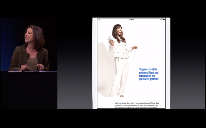 The most significant developments over the past few years have been led by social media platforms like LinkedIn and Facebook, who had the foresight to incorporate the technology of news readers into their platforms. Recognizing the power of this medium, Apple had to rethink how this technology could best be used to enhance its existing services.
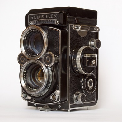
At WWDC 2015, Susan Prescott, Apple’s Vice President of Application Product Management, introduced Apple's new strategy for integrating news and RSS feeds into the ecosystem of Apple mobile OS. Starting now, businesses and individual bloggers can begin submitting RSS feeds to Apple to be featured in Apple News in the fall of 2015. However, this is just the beginning. When Apple News is released, Apple will also release a publishing platform called “News Publisher.” This will enable content creators to publish news stories with custom typography, animations, video, and photo galleries that are displayed in a beautiful responsive layout that is formatted for the iPad and iPhone. In contrast to the impressive innovations introduced by the leaders in this market, News Publisher will set Apple's service apart from its competitors. Apple News will include all the features we have come to expect from news readers (diverse content, customization, saving articles, etc) but integrating those features into iCloud, supported by a software tool for designing and laying out original content. Furthermore, Apple News will be accessed from the home screen of your iOS device, making the integration of news a seamless part of the iOS experience. The leading news readers have already established a precedent for what is possible with this exciting medium, and the uniqueness of their platforms (e.g. LinkedIn and Facebook) will continue to sustain them for years to come. Yet, Apple News, combining Apple's unique ability to integrate hardware, software, and cloud-based services, could be a game changer. Stay tuned for the release of Apple News Format, which will provide a publishing platform to laying your news content. It will be free to anyone with an Apple I.D. During the first few weeks of June, a number of apps for iOS received some pretty impressive updates. In the following video feature, I address updates to Flipboard, Paper by Fifty-Three, Google Photos, and Curator. Recently, Instagram reached 300 million active users, including a 50% growth from just nine months ago. The most distinctive feature of Instagram is the standard square format for posting photographs, art, text, or just about anything. With so many active users embracing Instagram as a visual form of communication, the square format has become a standard by which we see things. In short, Instagram has played an instrumental role in shaping our aesthetic sensibility, in regards to how we see, frame, and construct the visual world. As a museum professional, I find this development to be intriguing and significant in light of how we have traditionally viewed works of art. For centuries, the rectangle dominated our field of vision. Whether you are looking at renaissance paintings by Raphael and Michelangelo, baroque paintings by Rembrandt and Caravaggio, Rocco paintings by Fragonard and Watteau, 19th century works by Ingres and Monet, or modern paintings by Picasso and Jackson Pollock, the vertical and horizontal formats shape our understanding and appreciation of those works. The most pervasive celebration of the rectangle occurs in cinema, with the aspect ratio forever widening our field of vision to encompass more of the periphery. Instagram, on the other hand, challenges the hegemony of the traditional rectangle. 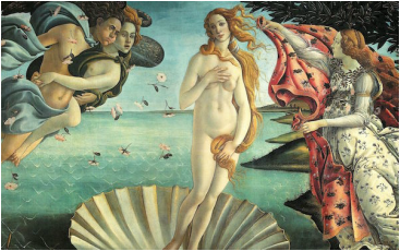 Botticelli. The Birth of Venus, c. 1486 Instagram's use of the square format is not a new paradigm as far as photography is concerned. In years past, photographers used square formatted film cameras like the double and single lens reflex cameras, Rolleiflex and Hasselblad, to capture beautifully composed photographs that rival any art form defined by the ubiquitous rectangle. Square formatted cameras were great for documenting everyday life and were the preferred choice of photographers who covered events for major news outlets. Yet, one can argue that Instagram brought the square formatted camera into the mainstream of our aesthetic consciousness.
Left: Rollieflex Twin Lens Camera; Right: Raymond Smith, Street Corner Preacher, Savannah, Georgia, 1974, silverprint. Instagram debuted in October 2010 and rapidly gained in popularity. In less than two years, the company claimed over 100 million active users. Recognizing this paradigm shift in the way users shared and consumed images, Facebook purchased the company in April of 2012. Since then, Instagram greatly exceeded Facebook in year-to-year growth, with a 23% increase in 2013 compared to 3% for Facebook. Now that Instagram has reached 300 million users, it is safe to say that the “square is the new rectangle.” The Shape of Things to Come In 2013, Apple unveiled a radical new design for the iPhone with the release of iOS 7. Along with the new flat design, Apple introduced the square camera mode, as an alternative to the normal 4:3 and 16:9 aspect ratios - a direct response to Instagram’s popularity. Now, with mobile phones glued to the palm of our hands, the square format is now immediately available as our aesthetic weapon of choice. The Square is Just Another Rectangle The square and rectangle are quadrilaterals and parallelograms, so a square is just a version of a rectangle. If that’s so, shouldn’t the same rules of composition apply to both formats? Not necessarily. For centuries, the rectangle has been used as a standard framework for structuring our field of vision. The rectangle compels the viewer to look up and down when viewing a picture vertically, and side to side when viewing it horizontally. As a result, the rectangle compels the viewer to find corresponding elements within the picture to complete the narrative. The square however follows a different trajectory. Rather than go from side to side or up and down, the field of vision follows the path of a circle; it centralizes your content, irrespective of where it’s placed within the picture. 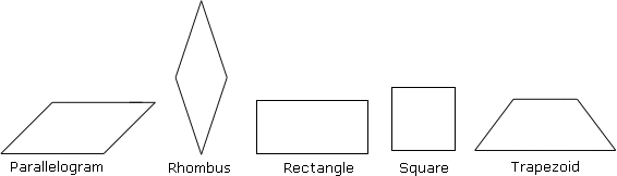 The Rule of Thirds Most people would agree that there is an art to taking a good photograph. This art is guided by organizing principles of design to help establish a structured and more harmonious composition. The rule of thirds is an organizational framework for dividing your picture into three sections, vertically and horizontally. Objects in space, including structures that run parallel to the picture plane (horizon line or table e.g.) are aligned with these guides, in some cases, placed at junctures where the vertical and horizontal lines meet. The guides are useful when objects are placed flush left or right or when the eye level is above or below. The basic logic of this system takes into account the vertical and horizontal lines that define the window through which we see things. If objects are placed parallel or relative to those lines (the boundaries of your picture), your composition is more likely to be more pleasing and natural to the eye. The grid lines appear by default when you launch the Instagram app and the iPhone provides this option in the settings menu.  Source: www.photographymad.com This rule makes perfect sense in the case of the rectangle, following a tradition that gave us the golden ratio and Fibonacci systems, which have existed since the renaissance. Yet, can we apply the rule of thirds to a square format? Yes and no. The Rules of Instagram In short, there are no rules. Instagram provides the ideal format for presenting any subject you desire the way you see fit, while the grid is available if you need it. Yet, there are some posts that seem to capture our attention in ways that do not necessarily abide by a single rule. Rather than view design principles as rules that you MUST follow, I propose that you consider the following as suggested guidelines for taking your Instagram posts to the next level.
Instagram User: chinamisakamoto Symmetry Since a square has equal sides, the most reliable design principle for creating a compelling Instagram post is symmetry. Symmetry involves the use of corresponding elements that balance the composition. Guided by a central axis, vertical or horizontal, elements are placed on each side of the picture (left/right, top/bottom) to create a mirror image or representation. Both sides appear identical, allowing for subtle variations and distinctions without disturbing the overall symmetry of the design. Of course, the most common, and, arguably, most effective approach on Instagram is the use of a circular shape placed directly in the center of the picture. Asymmetry Asymmetry can be used to vary both sides of a composition (e.g. you may have two small objects on one side of your picture and one large object on the other, or one object on one side and nothing on the other). In short, asymmetry avoids the use of a mirror image. However, asymmetry does not mean that a composition is devoid of balance. The size of an object can be compensated by a change in weight or density, offering a lighter or darker tonality. The “absence” of an object (e.g. a solid background) can also imply the “presence” of one, creating a balance that is more suggestive. Occasionally, you will find an Instagram post where a single image is placed in the corner of the picture, leaving the rest of the space empty.
(Left) Instagram User: ladyandpups; (Right) Instagram User: sternmanrule Solid backgrounds Some of the most beautiful Instagram images I’ve encountered make use of a white or black background. Unlike pictures taken in situ (original place), some Instagrammers choose to manipulate the background by using apps to erase it or use objects with transparent backgrounds and adding them to solid layers. By eliminating extraneous elements, your subject takes center stage and commands your viewer’s attention. Apps that make use of layers include Adobe Photoshop Touch and Leonardo, among others.
(Left) Instagram User: brigadeirochoc; (Right) Instagram User: bonnietsang Light and Shadow Instagram appeals to our sense of immediacy, so it’s easy to overlook the power of light and shadow. Lighting can add drama to your photos, reinforce a focal point, while subduing other areas. A stark contrast between lights and darks can also flatten your picture and blur the boundaries between objects, creating surprisingly effective patterns of light that envelope the entire image. Light and shadow thereby become the unifying elements of a picture, especially when your composition lacks balance or visual appeal.
(Left) Instagram User: wolvestable; (Right Instagram User: photographybykarina Depth of Field Another common technique for creating dynamic Instagram shots is the use of depth of field to create distance. There are many approaches to DOF when using a mobile phone. For example, Instagram includes the Tilt-Shift tool, with radial and linear options for blurring sections of your photos. The former can be used to place greater focus on a person in the foreground, while the latter can be used to enhance the distance in a landscape or street scene. Another variant of DOF is perspective. Perspective The linear and geometric boundaries of the camera compel us to take photos of images that are parallel to the edges of the frame. Yet a change in perspective can add dynamism to your photos and capture the interest of the Instagram community. The most popular example found on Instagram is the camera tilted downwards at your feet. This simple technique disrupts your normal field of vision, creating the illusion of linear distance within a square format that is primarily cyclical. In some examples, the photographer will choose to stand on a cliff, adding depth of field to heighten the perspective. The more classic approach to perspective involves the use of one point perspective, in which everything appears to converge at one point in the distance.
(Left) Instagram User: iza_goulart; (Right) Instagram User: mrpaddingtonbear Cropping Most of us desire to create an attractive and pleasing image. In doing so, we want our subject to be seen in all its splendor. Yet, as far back as the 19th century, the cropped image was seen in direct correlation to the fleeting realities of modern life. This reality has been amplified a thousand-fold today, so cropping will undoubtedly have a much stronger appeal. The most common use of this technique on Instagram includes the dual use of perspective that captures the bottom half of someone’s legs and feet, often placed diagonally from the corner of the picture. This technique is also ubiquitous among chef’s and culinary professionals who present three quarters of a plate, forming an arc across the picture frame. This approach also makes use of asymmetry, which ironically appears perfectly balanced.
(Left) Instagram User: grungeee; (Right) Instagram User: reinaldo Lend a Hand Consistent with the use of extended legs, fragments of the human body add a human element to your arrangements. In many Instagram posts, hands extend into the picture (usually holding an object), forming the central axis and focal point around which various objects are situated. Since the hand is divorced from a recognizable body, the hand functions as an invitation for you to join in. Aerial View Views from above are quite common on Instagram, mainly because they provide a way to view your composition as a flat two dimensional design. Formal elements like shape, line, pattern, and color are used to structure the composition. If you are looking to highlight a special recipe or priceless possession, or capture a special moment in time, designing your picture from above can add elegance to your Instagram posts.
(Left) Instagram User: royalebrat; (Right) Instagram User: filthyfacades Patterns The camera lens can also be used to capture patterns that are inherent in nature or expressed through man-made structures. There are a number of Instagrammers who focus on patterns as a primary feature of their work. While many of the images are derived from specific places, the photographs reveal patterns of light and color that emphasize their formal quality, which transforms normal depictions into works of art.
Instagram User: allthingssuzette Pictorial Elegance Most of the techniques mentioned above are used during the photographic process. Yet, there are some Instagrammers who are chefs, fashion designers, illustrators, digital, and graffiti artists. As a result, some people may spend more time composing their images before they are imported into Instagram; or artists may prepare their art to be viewed in a multi-faceted way, designing content for clients in one instance, while reformatting or re-presenting their work for Instagram. Instagram’s popularity is largely due to its accessibility and ease of use. Regardless of region, age, gender, profession, experience, and technical ability, Instagram has value for everyone. One may even argue that the square format contains a quality of universality. Whether one is apt to post a flattering selfie, or compose an elegant picture, the square is the new rectangle. Author: Timothy Paul Brown
Profession: Curator of Education, Montgomery Museum of Fine Arts Tech Blogger: My Apple Podcast The following iPad resources were presented at the AAEA conference for art educators held at the Montgomery Museum of Fine Arts on November 14, 2014. Presenter: Tim Brown, Curator of Education, MMFA and Host of My Apple Podcast PRODUCTIVITY
KEYNOTE BY APPLE, INCKeynote is a presentation tool that is part Apple’s iWork suite (Pages, Keynote, Numbers). The application offers tons of functionality, including a beautiful array of templates, animations, and builds. Keynote comes with markup tools and users can connect remotely with the app using other iOS devices. iCloud support also makes it easy to access presentations across devices or from any computer. DROPBOX BY DROPBOX
Drop Box is a great solution for cloud-based storage, available for all file types, including video, photos, and project files like powerpoint, keynote, and photoshop. This app is available for mobile platforms and the desktop, and can be accessed directly inside most apps on your device. Dropbox also comes with an “Open In…” app option, which makes it very easy to import content from Dropbox to applications installed on your device. PDF TO JPG BY XU JIANWEI
The iPad is versatile, but for multiple functions, you often need multiple apps. This application provides a unique service, enabling you to convert PDFs to JPGs, which can be saved to your camera roll. This option is very convenient since Apple does not provide a way to save PDFs to a central location like iCloud (which is not available as a standalone app). VIDEOIMOVIE BY APPLE, INC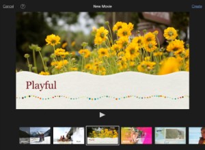
iMovie is a native iOS application designed by Apple, Inc. The application comes with a variety of themes for typography integration, and import options for photos, videos, music, soundtracks, and sound effects. iMovie also enables you to layer content using the picture-in-picture option, and the ability to detach audio from video clips. If you like to record events or sessions on the fly, iMovie comes with built-in record features, and a wide range of adjustment tools for fine tuning your projects. The hidden gem inside iMovie is the option to create movie trailers, guided by storyboard layouts, and an easy drag and drop interface. PINNACLE STUDIO BY COREL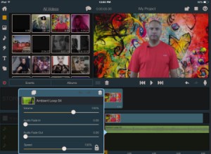
Pinnacle Studio is nice alternative to iMovie. The application comes with advanced editing tools for adding text, transitions, video, photos, and montages. Pinnacle Studio offers slightly more control over your ability to customize content, including the ability to control how content is layered, including the ability to add PNGs as transparent overlays. The app also comes with a range of options for syncing to cloud-based services like Dropbox, Box, Google Drive, and Microsoft One Drive. EASY STUDIO BY LES TROIS ELLES INTERACTIVE
Easy Studio integrates the formal elements of art (line, shape, and color) with the techniques of stop motion video. Students and teachers alike can explore endless possibilities for organizing shapes and colors into creative and imaginary scenes. In order to make this technology accessible to all children, the application comes with start up templates that guide children through the basic steps. All projects can be saved to the project library or to the camera roll. PHOTO EDITINGADOBE PHOTOSHOP TOUCH BY ADOBE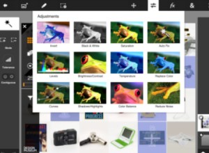
Adobe offers the most advanced photo editor for iOS. For pro users who are accustomed to layers and the toolbar that comes with most desktop photo editors, Adobe PS Touch offers a comparable experience for the tablet. The app comes with customized layouts, layers (as many as 18 elements), adjustment tools for contrast, brightness, exposure, color balance, noise reduction; effects for adding blurs, tints, lighting, and artistic effects like acrylic paint, watercolor, and scratches; and a multitude of enhancement tools such as cropping, rotation, gradient, lens flare, fill and stroke, text, warp, camera fill, and image size. The tool bar includes brushes, stamps and clones, blur, paint brush, erasers, wands, and various selection tools. Projects can be organized in folders and shared to the camera roll, Adobe Creative Cloud, and saved in either jpg or png formats. LEONARDO BY PANKAJ GOSWAMI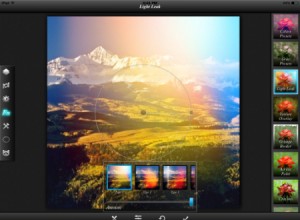
Leonardo is an advanced photo editor for iOS that offers features that are comparable to Adobe’s photo editor. The app comes with advanced photo editing features, including layers, blending options, and toolbars for an infinite variety of adjustments and effects. Adjustment tools include the ability to control exposure, contrast, color vibrance, grayscale, improve clarity, sharpness, blurs, and vignettes. Effects include color and gray scale presets, light leaks, acrylic, crayon, color fill, reflection, drop shadow, emboss and various distortion effects. Tools also provide the ability to straighten, flip, rotate, clone, paint, add text, gradients, and vary the scale of elements. Selection tools provide added flexibility for modifying specific areas, and masking tools to make it easy to conceal, control, and erase select areas. PIXELMATOR BY PIXELMATOR
Pixelmator is the latest photo editor for iOS, offering what could very well be the ideal iPhoto replacement. Pixelmator, originally designed for the Mac, offers some of the same advanced features, but specifically designed for a tablet interface. The most noticeable features of Pixelmator include the use of the drop down inspector window (similar to Apple’s iWork applications) for project and tool adjustments, including the ability to add and control images, text, and various vector graphics. Unlike most photo editors, Pixelmator offers plenty of paint brush options, distinguishing the app as both an editor and creation tool. The app also includes other features that are unique to the iOS experience, including the ability to import images into collages, frames, cards, posters, and several photographic effects. The app syncs with iCloud and makes use of the “hand-off” feature when switching to a Mac. ARTPAPER BY FIFTY-THREE
Paper is an award winning drawing application developed specifically for the iPad. The app comes with a virtual palette for mixing colors, and virtual drawing tools, including pens, markers, and brushes. The app is distinguished for its unique user interface design, making use of pinching and swiping gestures for easy navigation. Most recently, Fifty-Three released a stylus, Pencil, which syncs with Paper and other third party applications, and Mix, an online community where users of Paper can share and edit the same content. Paper is also distinguished by the use of virtual journals, which can be used to organize your inventory of drawings and/or drawings assembled from members of the “Mix” community. TAYASUI SKETCHES BY TAYASUI
Following the success of Paper by Fifty-Three, Tayasui Sketches makes use of the same sketching features as its competitor, including an advanced tool bar for accessing various drawing tools and brushes, and a similar use of pinch and swipe gestures for navigating and organizing sketches. Some features that make Tayasui Sketches unique, including the ability to use layers, import photos, and add various simulated papers as a foundation for artwork. Throughout its version history, Tayasui Sketches has evolved to incorporate Apple’s design changes introduced in iOS 6, iOS 7, and iOS 8, including a unique combination of 2D graphics, a minimalist design, and early remnants of Apple’s use of Skeuomorphism to replicate objects in the real world. TOUCH DRAW
TouchDraw is a mechanical drawing application that provides a range of options for manipulating vector graphics. The application differs from painting and drawing apps by providing the ability to edit each individual element, irrespective of the assigned layers. The library also includes flow charts, architectural shapes, a basic icon library, balloons and callouts, simple shapes like arrows and hearts, and a range of import, export options. With each element, you can control common attributes like stroke and fill tools, shadow, opacity, blending modes, and canvas features, such as backgrounds, and units and rulers. ART AND TEACHING RESOURCESINTERACTION OF COLOR BY JOSEF ALBERSFirst published in 1963, Josef Albers’s Interaction of Color is one of the most influential books on color ever written. The classic text achieves its full, interactive potential in this stunning, award-winning application for iPad. The app includes full text and plate commentary, 125 original color studies, 60 interactive plates, palette tool, and the ability to save and export your final projects. THE DESIGN MUSEUM FOR IPAD
The Design Museum Collection App for iPad presents 59 remarkable objects from London’s Design Museum; these key pieces from the collection are explored through film, audio, text and photographs. Search options include: time, material, colour, location, manufacturer and designer. Classic pieces include: the Anglepoise lamp, the Dyson vacuum, the Thonet chair, the Face magazine, the British telephone box, the Vespa and the Kindle, a recent addition to the Collection. THE GREAT PHOTO APP by BAGLAN DOSMAGAMBETOV 
The Great Photo App is a visual guide to everything you need know to be a good photographer. The app comes with interactive lessons that cover the foundations of photography, including, exposure, apertures, lighting, depth of field, and studio preparation. The app is distinguished by the user interface, including swiping gestures for animating and navigating content. Highly recommended! DOODLECAST PRO BY ZINC ROE 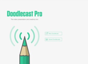
Doodlecast Pro is the easiest way to create presentations on your iPad. The app records your voice as you draw to create quick presentations. Doodlecast Pro saves videos to the camera roll making it easy to import them into popular video editors or presentation tools such as iMovie, Keynote, or iBooks Author. Perfect for teachers, students, business people and anyone needing an elegant way to share ideas. With Doodlecast, you can import photos or use multiple pages for more elaborate procedures.
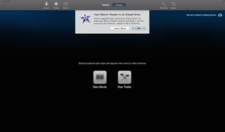
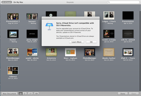
For those of you who own Apple devices and computers, you most likely have iCloud. iCloud stores files you use on a regular basis like photos, music, calendars, books, apps, so that you can stay connected to your content across devices. Recently, Apple also included other services like iMovie Theater, located inside the iMovie app, which enables you to store video files in the cloud, and iWork for iCloud, which gives you access to Keynote, Pages, and Numbers. iCloud Drive During WWDC, Apple introduced iCloud Drive, a greatly expanded cloud service that now stores files from just about every application on your Mac or iOS device. The most notable addition to this service is the inclusion of video files. If you agree to subscribe to the new iCloud Drive service during the installation of iOS 8, you will notice in settings that this service is currently in Beta. Tech bloggers made note of this right away, quickly alerting Apple users to avoid switching to iCloud Drive. As a service currently in beta, the warnings were warranted, mainly because iCloud Drive is not an extension of your previously iCloud service but a replacement. As a result, you will encounter some consistencies regarding files you can access from you Mac as opposed to your iPhone or iPad. In some cases, you may notice inconsistencies between devices as well. Yosemite and iOS 8 The significance of having the new iCloud Drive service is to improve synchronization across your Mac and iOS devices. Unfortunately, iCloud Drive was released in a beta version, largely because the service was ONLY available to iOS devices, not the Mac. If, for example, you chose to upgrade to iCloud Drive, you simultaneously initiated a process that disabled access to iCloud projects, like keynote presentations from your Mac. For example, upon launching Keynote on my Mac, I received the following pop-up: Sorry iCloud Drive is not compatible with OS X Mavericks. Of course, I received the same error message on my Mac when I tried to access iMovie Theater projects in the cloud.
Problems, but not really
I discovered some problems with the transition from iCloud to iCloud drive. For example, I began to notice that I could access Keynote presentations from my iPhone 5S, but I could not access them from my iPad 3. This did not seem to have anything to due with the devices, but more with a delay in the transmission or transfer process. I also experienced the same problem with iMovie. I saved several projects and videos to the new iCloud Drive service using my iPhone, but I could not access them from my iPad. It took a week before I would find parity across devices. In summary, the transition to iCloud Drive will include some growing pains. The process of transitioning from iCloud to iCloud Drive will not be complete until users are able to download Yosemite for the Mac. If you are not a Mac user, the process will just require a little bit of patience. If you are still in a panic, you can alleviate your fears by going to www.icloud.com. |
Timothy Brown
Host of My Apple Podcast. Categories
All
|


 RSS Feed