iOS 7
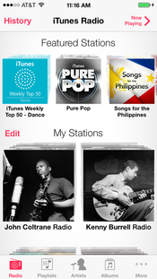
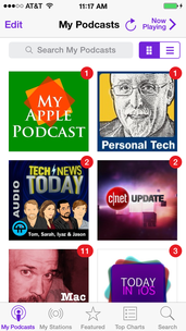
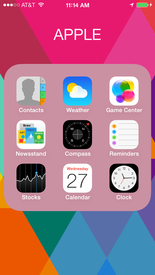
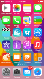
In contrast to previous versions of the operating system, Apple chose to simplify the look and feel of the design. Gradient bars, textures, realistic details that recall real-life objects have been removed and replaced by flat, simpler designs. The new look is evident in the minimalist design of iOS applications and icons, as well as menu buttons and navigation bars.
|
|
|
|
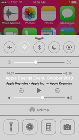
Apple introduced brighter tints to the color scheme, and folders are now translucent to allow light to come through. Light is a strong component of the new design, serving a nice compliment to new parallax feature. The native icons for Apple's native applications were redesigned to be flat and simple, eliminating unnecessary details. Most noticeable is the absence of gradients, and reflective light across the surface of each icon. Multi-tasking was greatly improved, allowing users to view the entire facade of previously open applications. Control Center is accessed by swiping up from the bottom, which provides easy access to common functions, like airplane mode, bluetooth, flash light, and Wi-Fi.